Geometry as a shared language
The cube mark extends into a line pattern, connecting the different packaging surfaces.

Cubic geometry. Distinctive packaging.
Logo and packaging for a coconut hookah charcoal maker from Tashkent: a 1 kg retail box and a 20 kg shipping master carton.
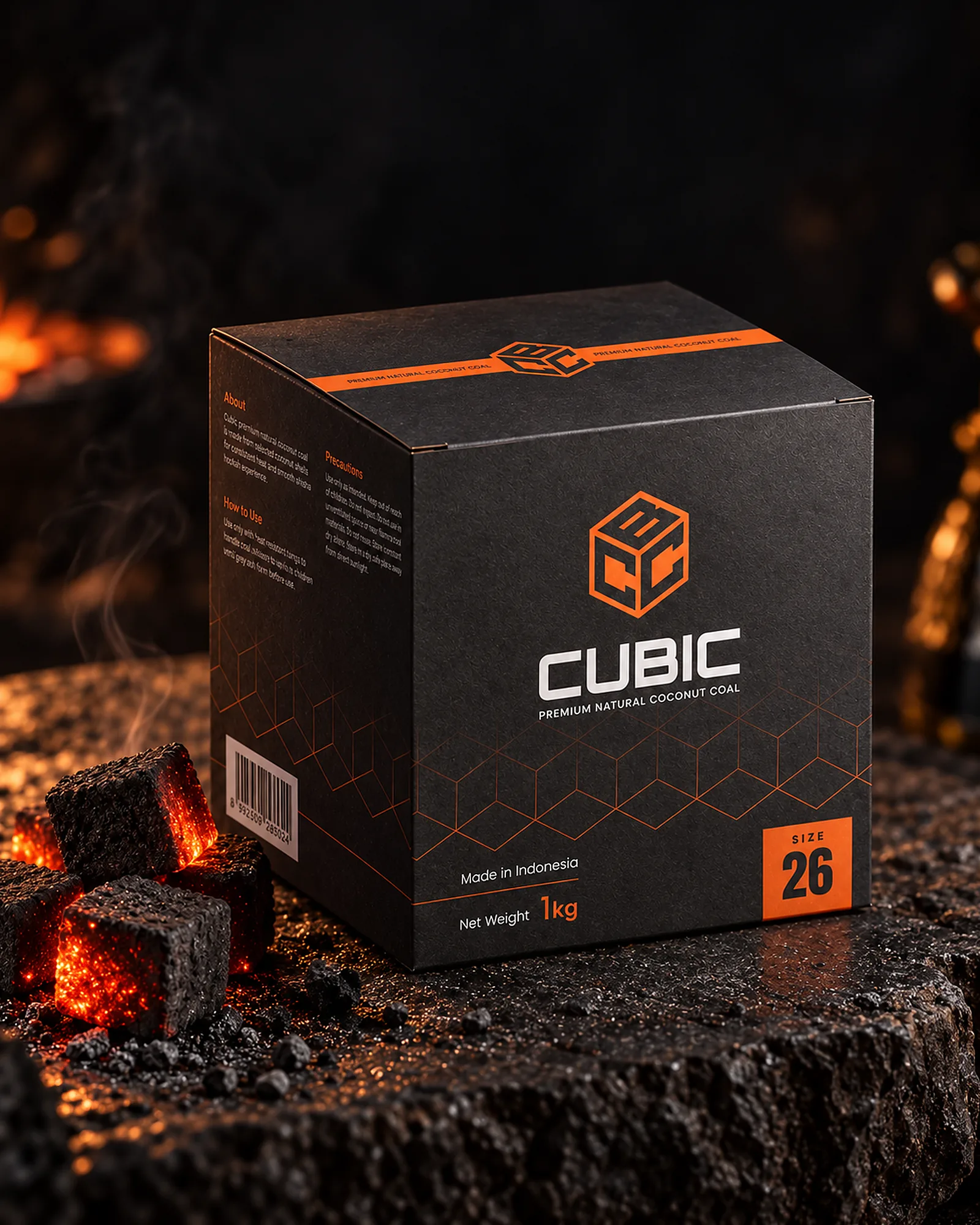
CUBIC needed a logo and packaging for two formats: a 1 kg retail box and a 20 kg shipping master carton. Both needed to read as parts of the same brand.
The packaging brings together the name, weight, charcoal size and usage information. A clear hierarchy separates the essentials from the technical detail.
The mark is built around a cube. Its form echoes the CUBIC name and extends into a geometric line pattern, giving the logo and the packaging a shared visual language.
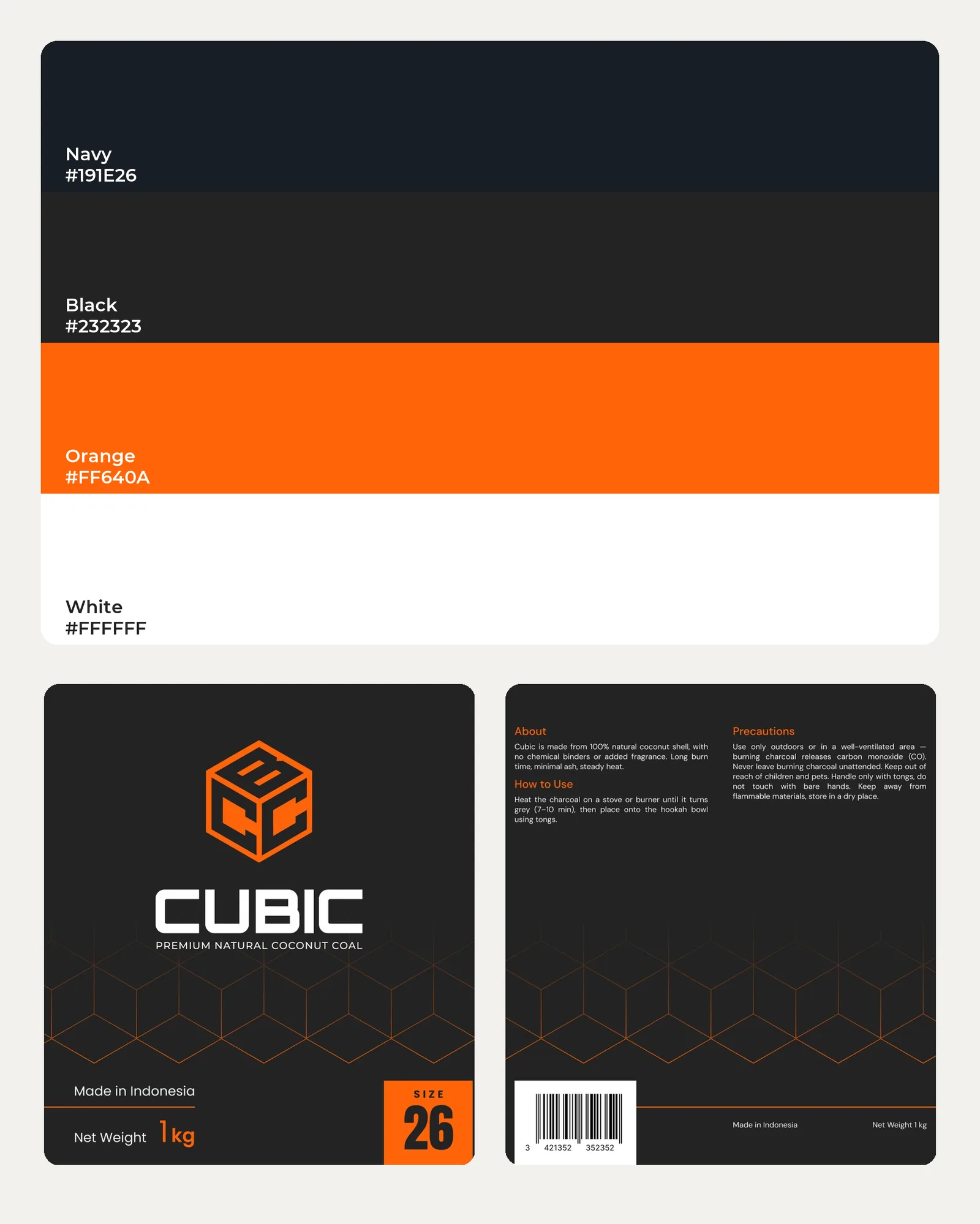
Dark surfaces provide a base for the white wordmark. Orange highlights the symbol, product specifications and selected information blocks.
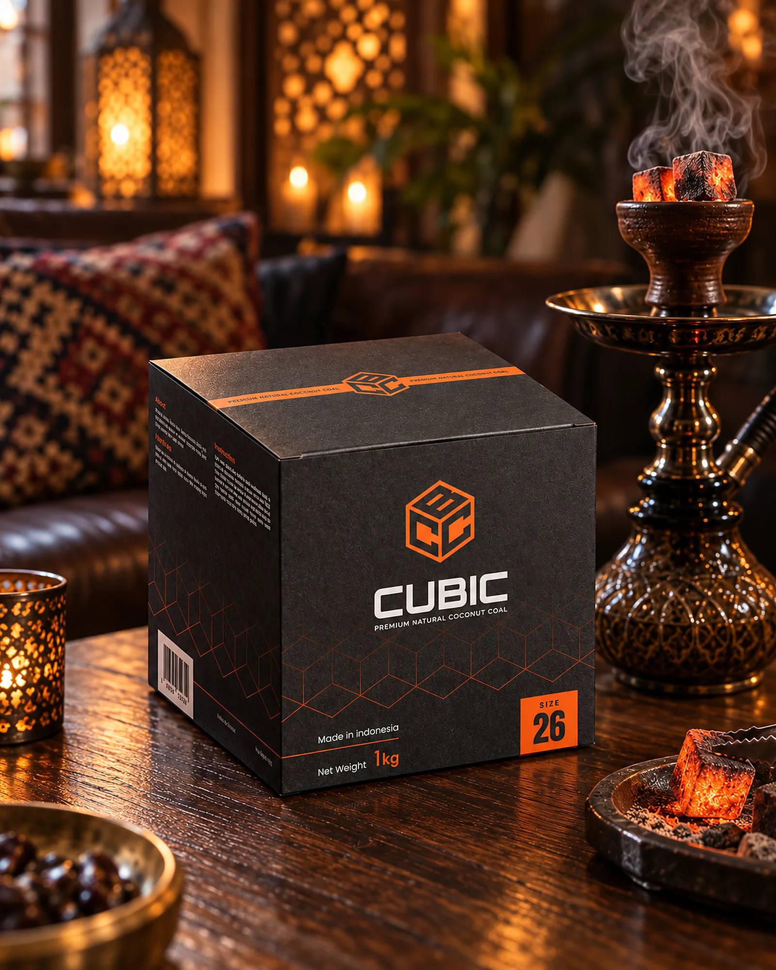
The cube mark extends into a line pattern, connecting the different packaging surfaces.
A dark base, a white wordmark and orange accents separate the background, brand and product specifications.
The name and key specifications sit on the front. The description, instructions and precautions occupy the side panels.
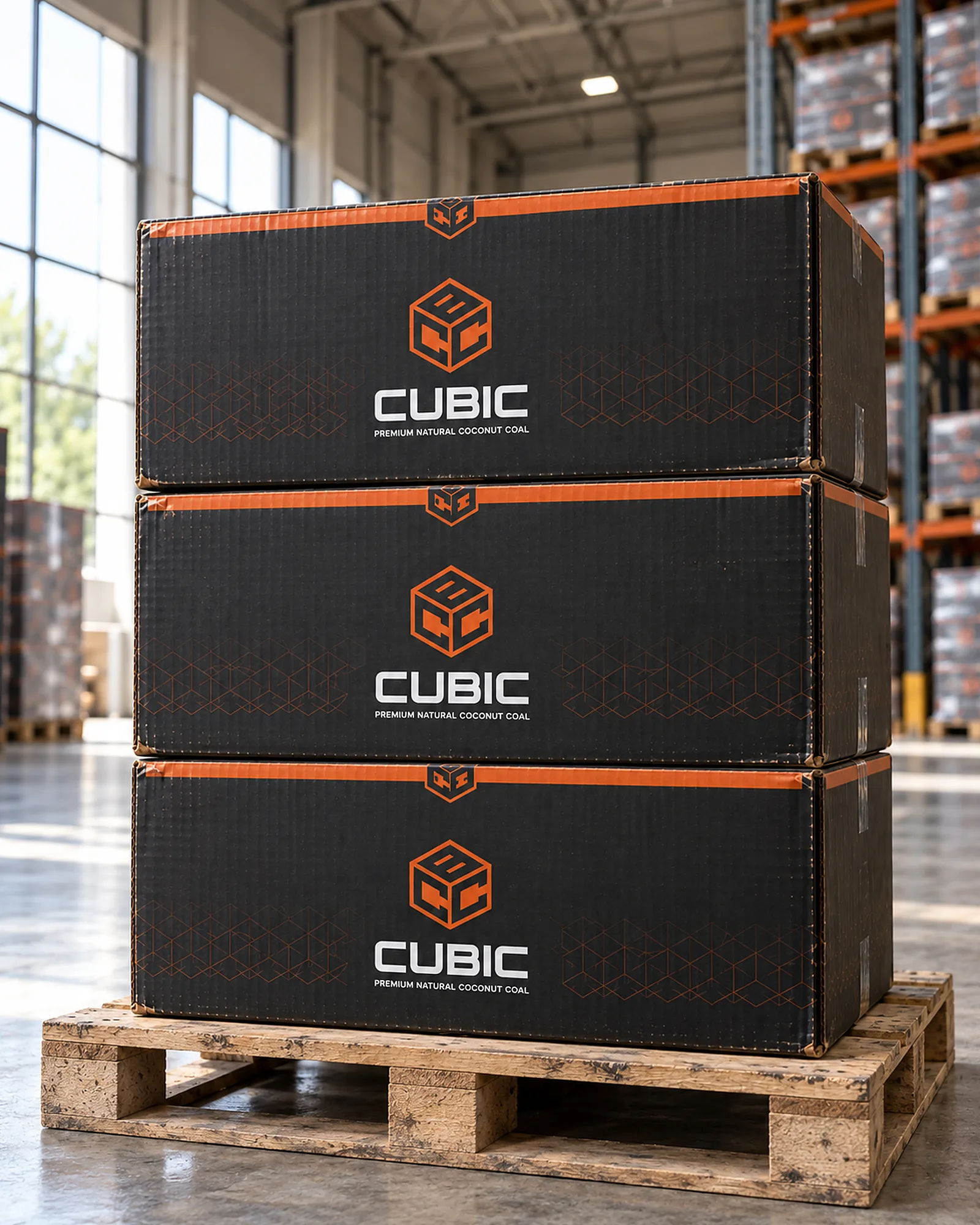
The logo, palette and pattern connect the 1 kg retail box with the 20 kg shipping master carton.
On the 1 kg box, the mark and name take priority. Side panels carry the description, instructions and precautions, distributing information across the surfaces rather than crowding it into one block.
The shipping carton uses the same colours and geometric elements. The dielines show how the design continues across panels and folds into the finished packaging.
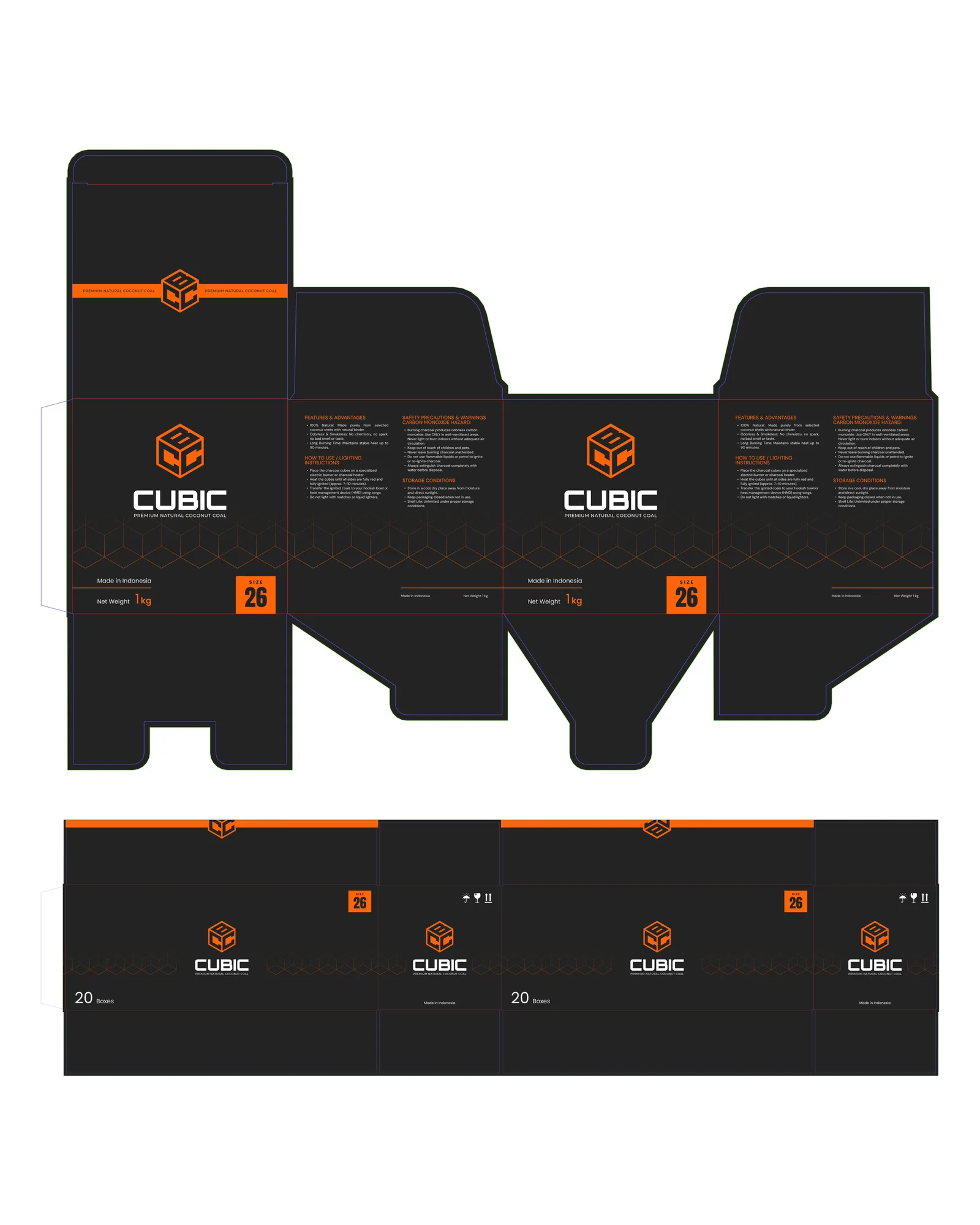
The project brings together the logo, colour system, retail packaging, shipping carton and their dielines. Visualisations show the design in three dimensions and in context.