Architectural lettering
The wide wordmark proportions connect the identity to modular construction.

Architectural precision. Natural warmth.
Identity for a modular house builder with a focus on sustainability. Logo, visual identity, brand book, collateral and merch.
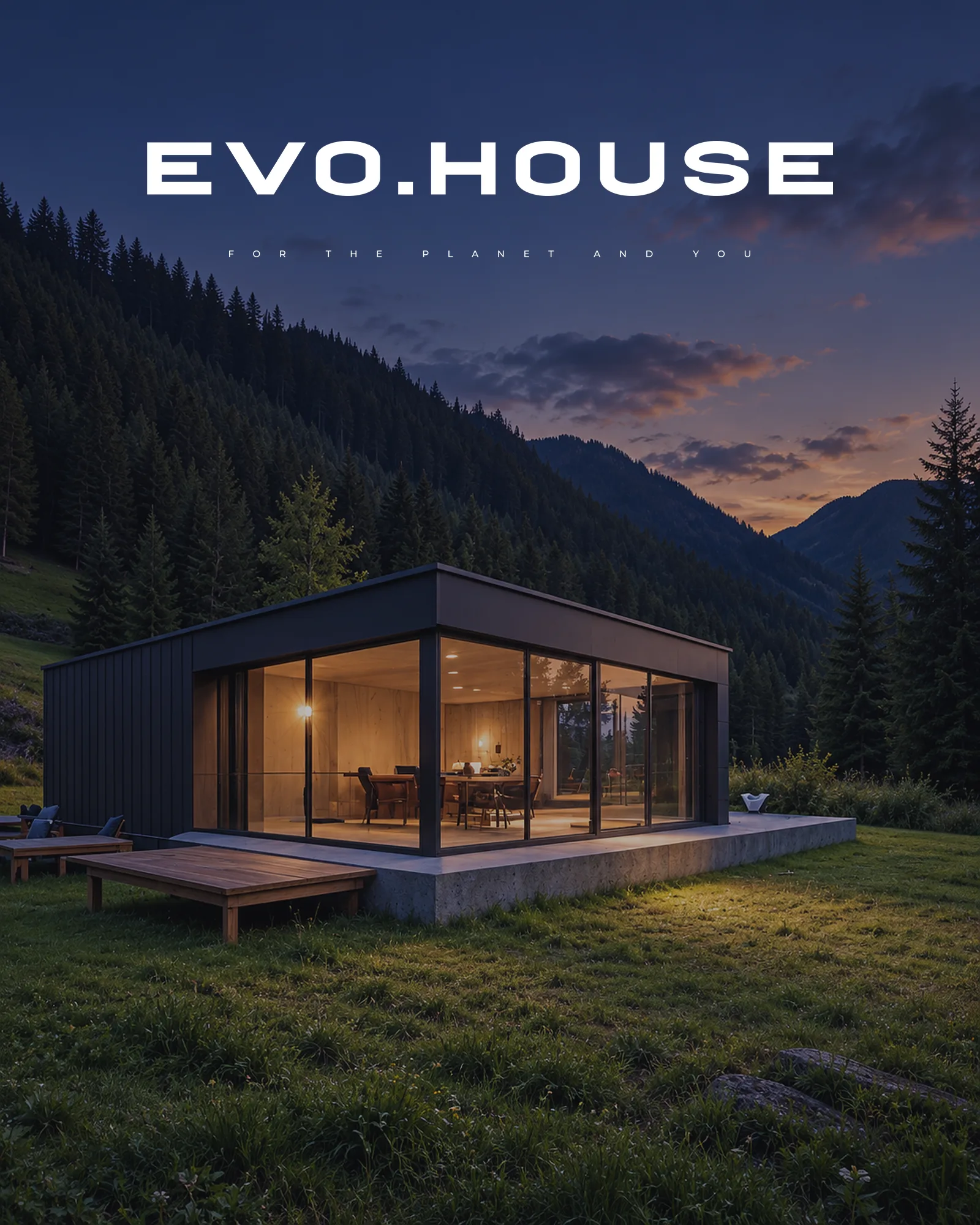
EVO.HOUSE builds modular homes with a focus on sustainability and evolution. The identity needed to connect the precision of modular construction with the warmth of natural surroundings.
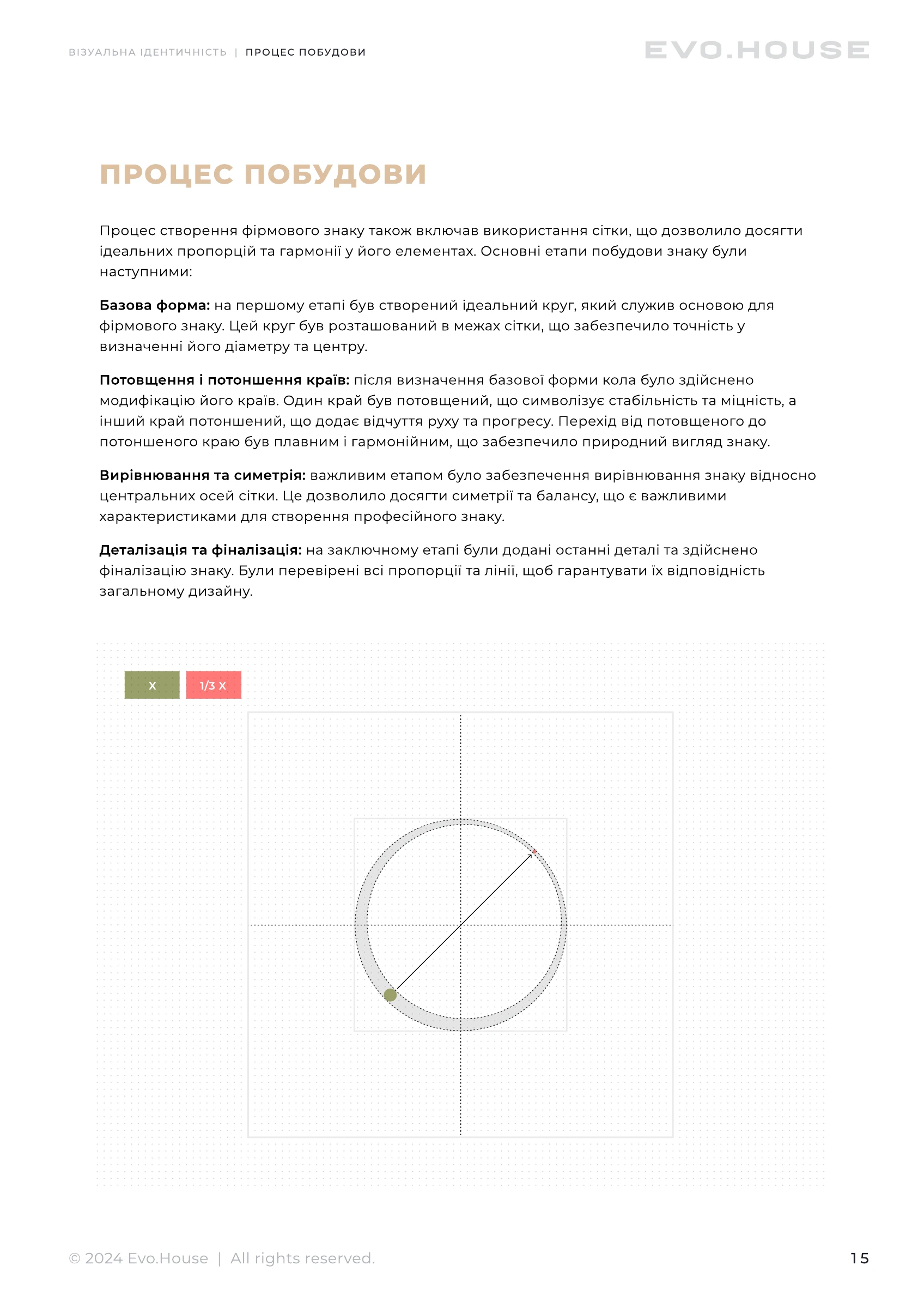
The wide wordmark has an architectural character. A separate circular symbol with a shifting outline recalls the planet and suggests movement.
The line “for the planet and you” connects environmental concerns with people’s needs.
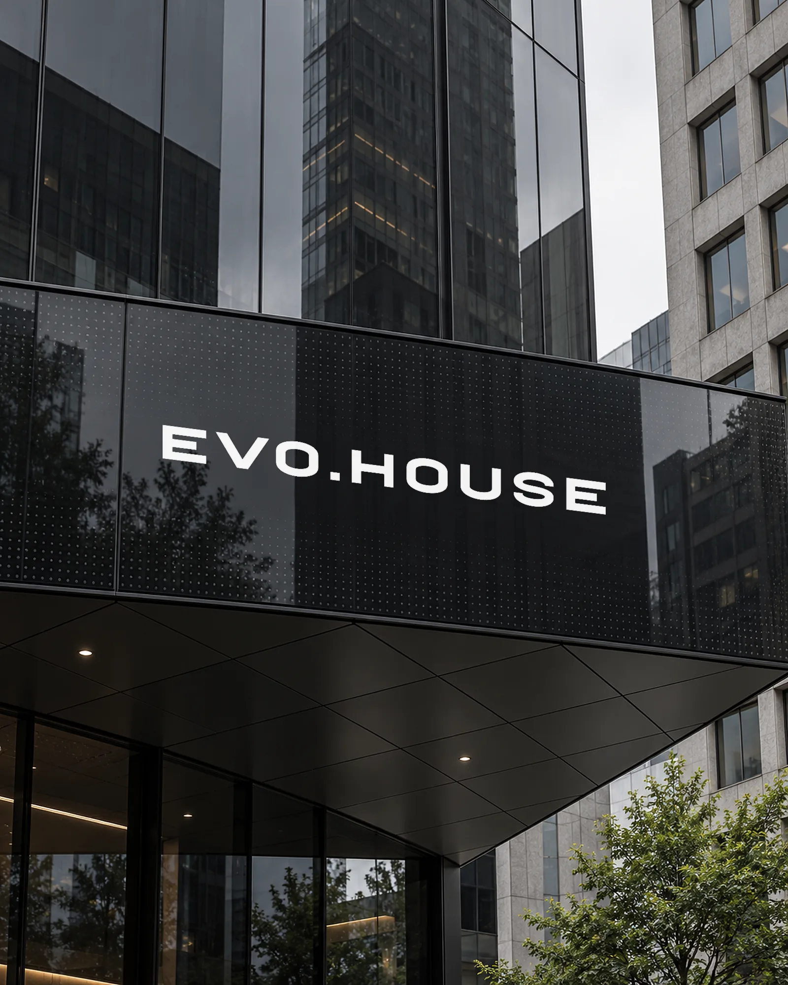
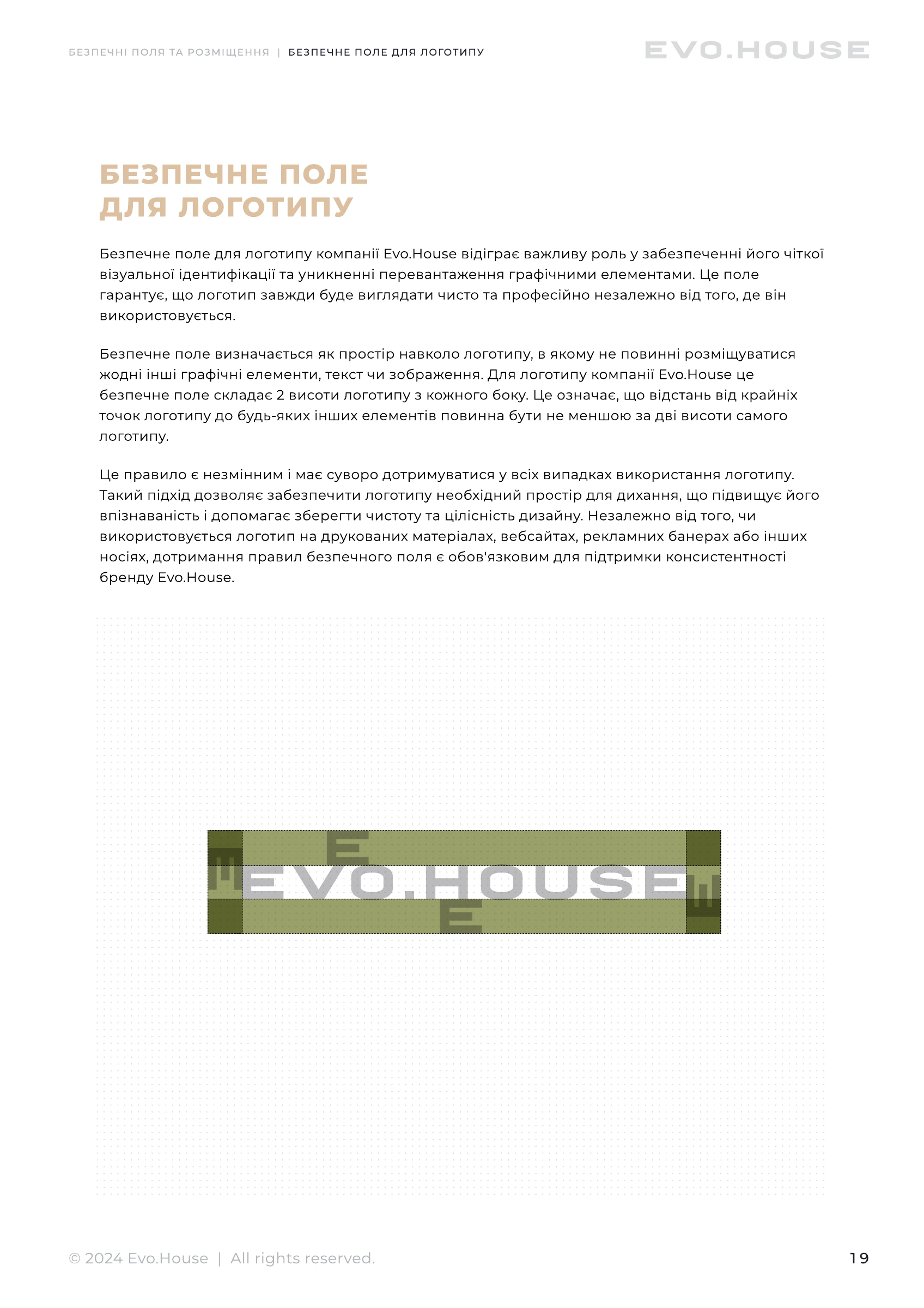
The wide wordmark proportions connect the identity to modular construction.
A shifting outline connects the standalone symbol to the planet and evolution.
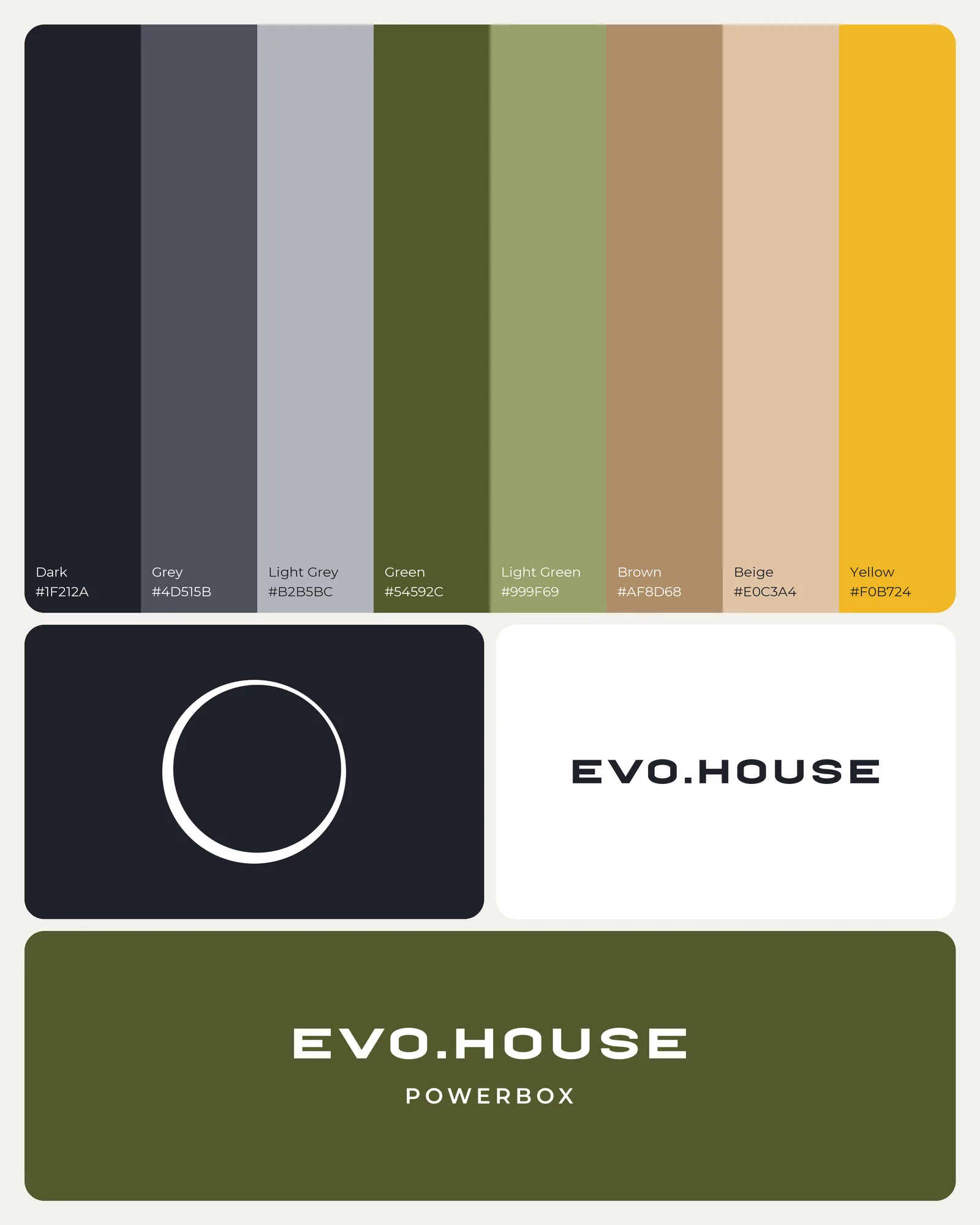
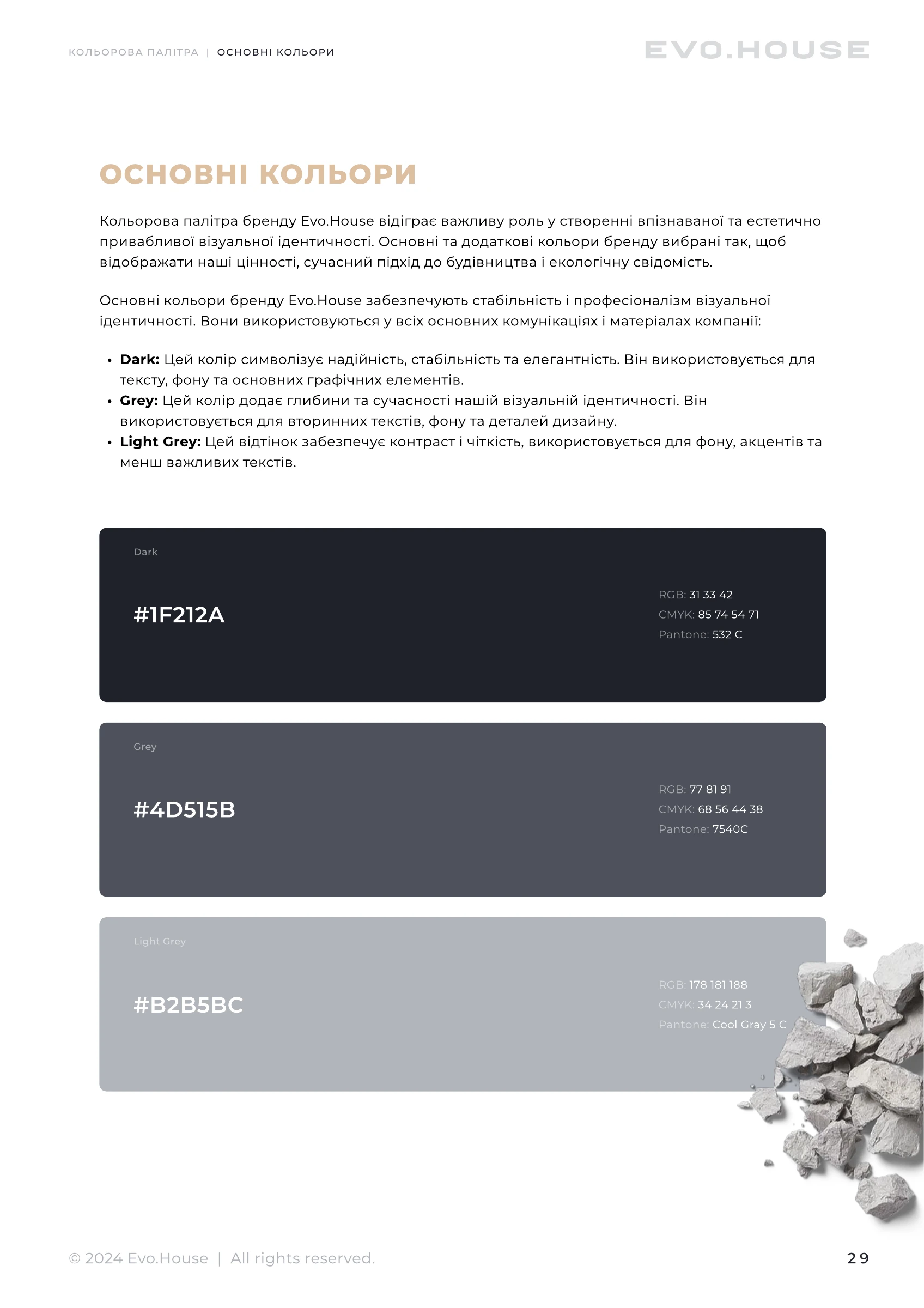
Graphite, olive and wood tones connect geometry with the warmth of materials.
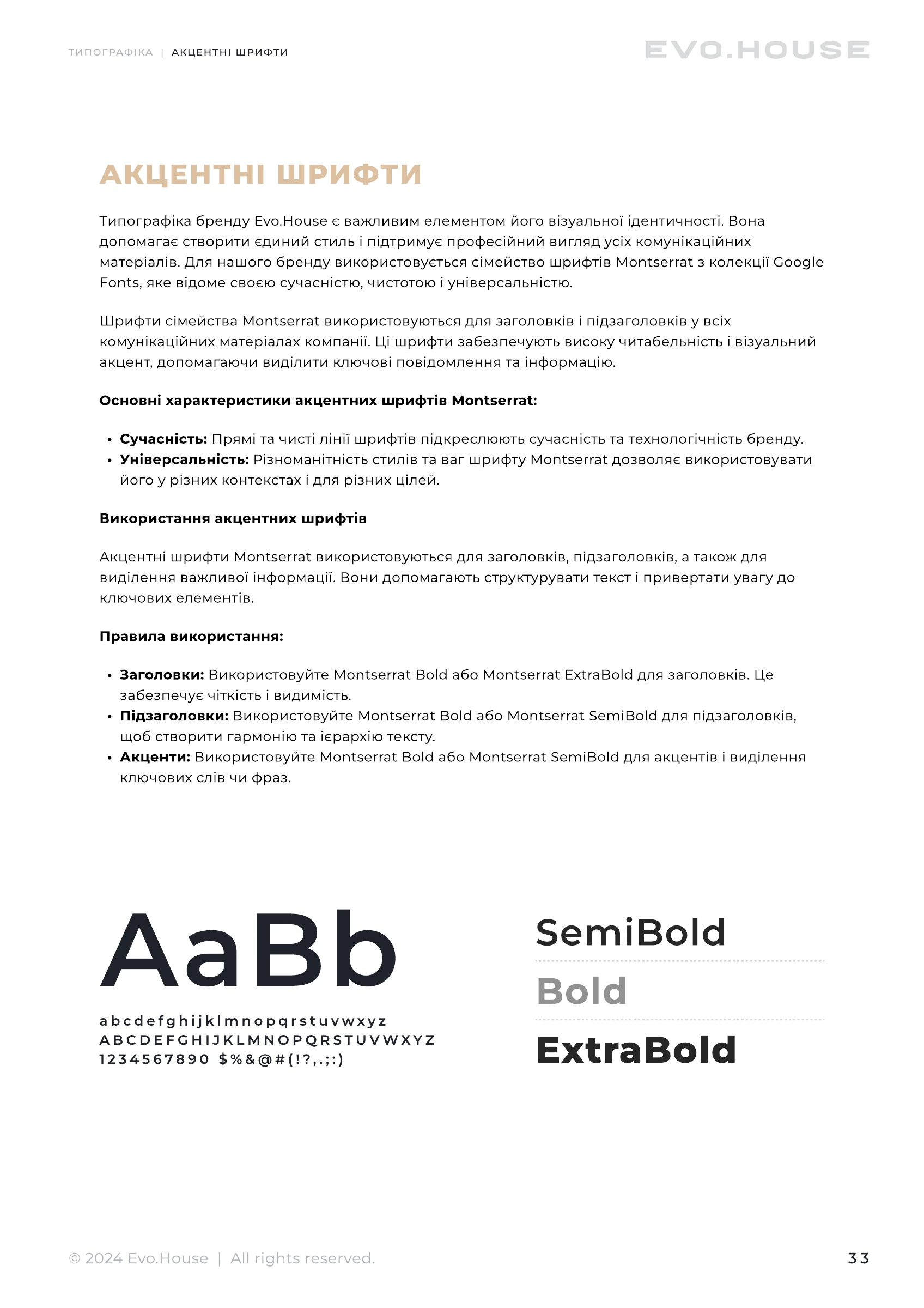
The brand book defines clear space, colour, typography and photography for consistent use.
Graphite tones sit alongside olive, wood, beige and sunny yellow, connecting the geometry of the logo with natural materials.
The brand book defines mark construction, clear space, typography, colour, photography direction and application rules.
Selected pages show the identity as a working system: construction, clear space, colour, typography and photography direction.
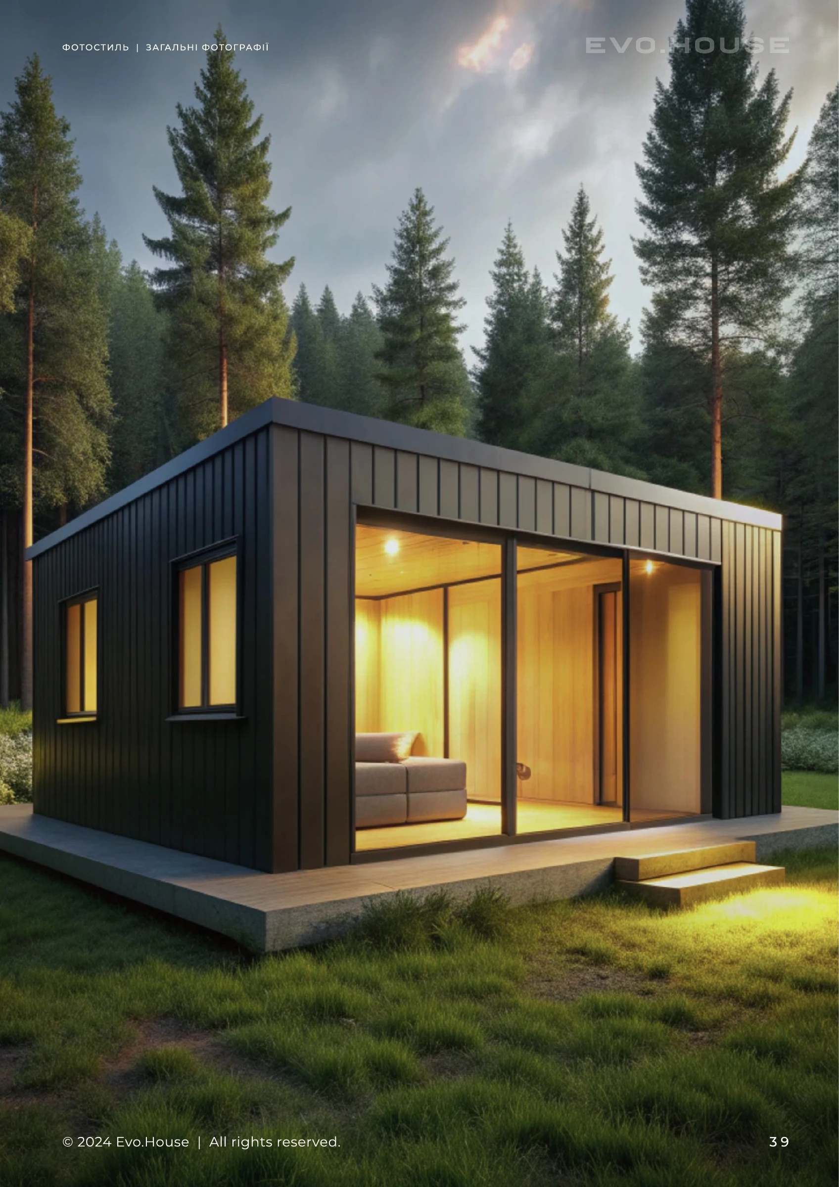
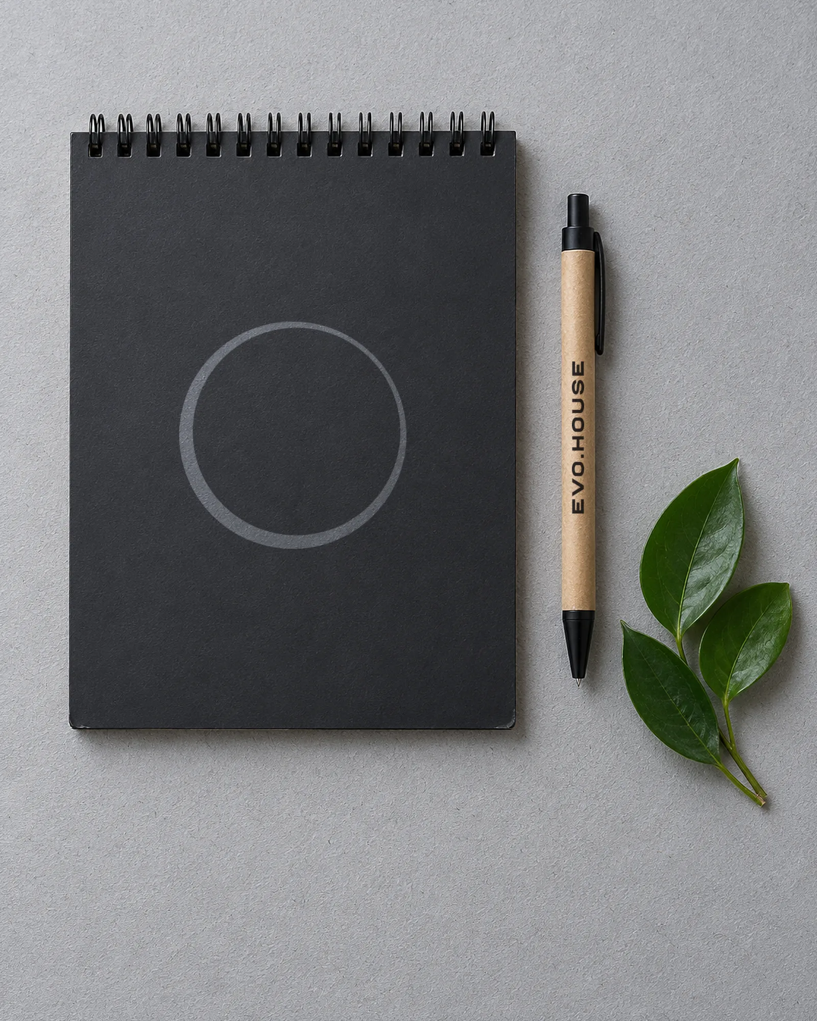
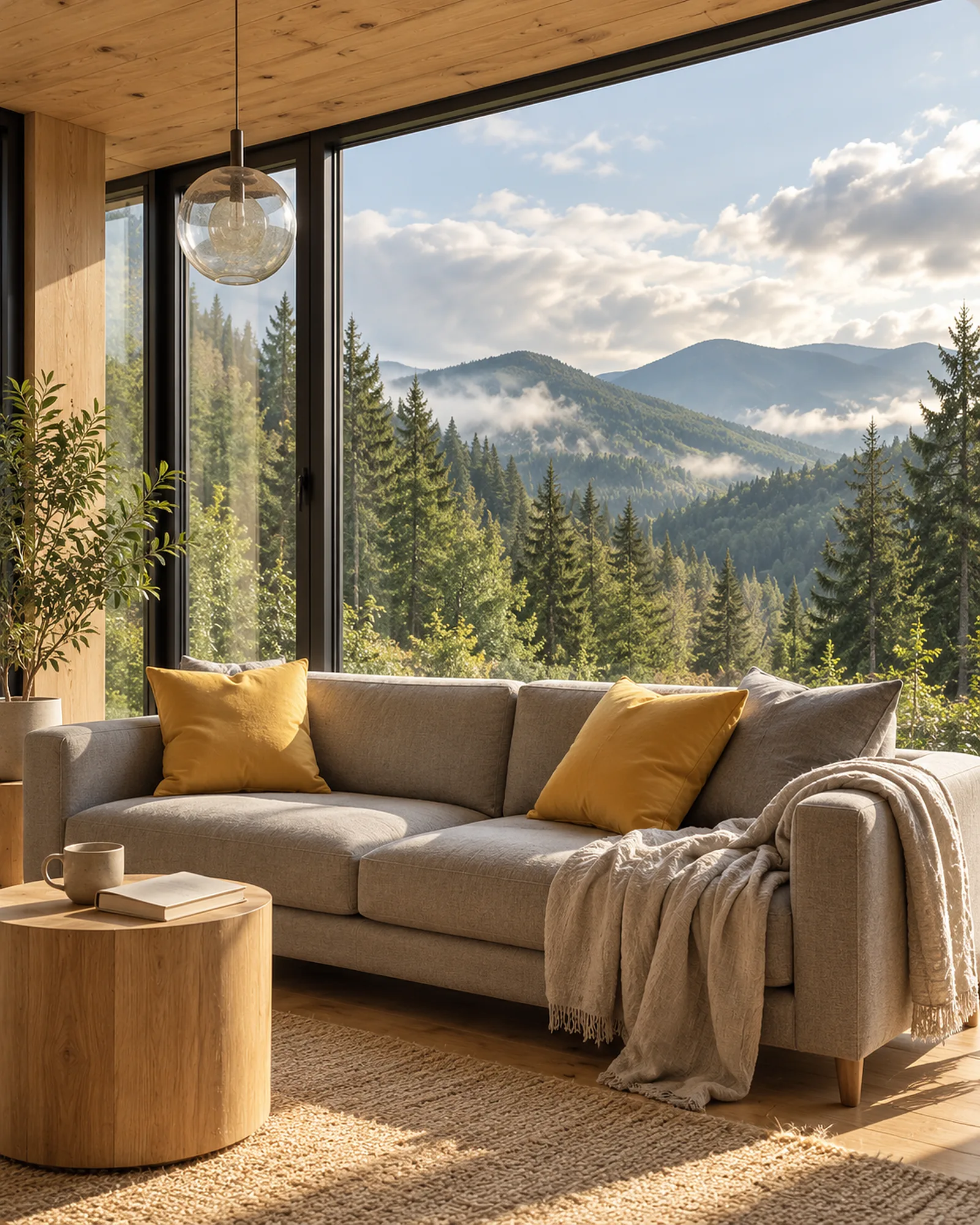
The project includes the logo, visual identity, brand book, signage, stationery and merchandise designs. Architectural imagery illustrates the brand’s photography direction rather than documenting completed buildings.