Photography sets the scale
Large yacht images lead the composition and keep the product at the centre of attention.

Superyachts take centre stage.
Desktop and mobile website design for Lazzara Yachts, a superyacht builder. The Lazzara logo belongs to the client.
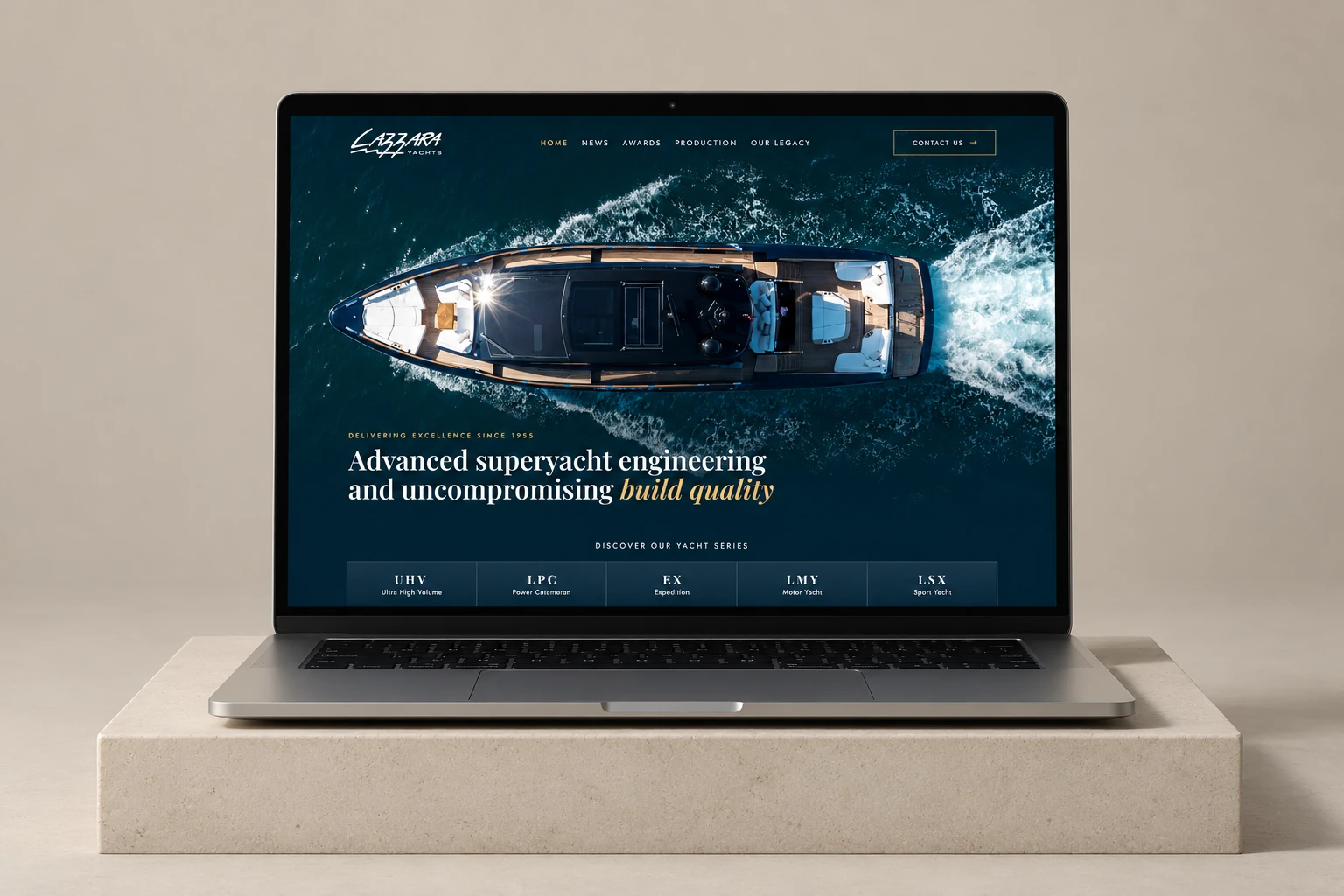
Large photography opens the site. Yacht series, interiors, production, awards and news follow. Each section has its own pace while leading towards a conversation with the shipyard.
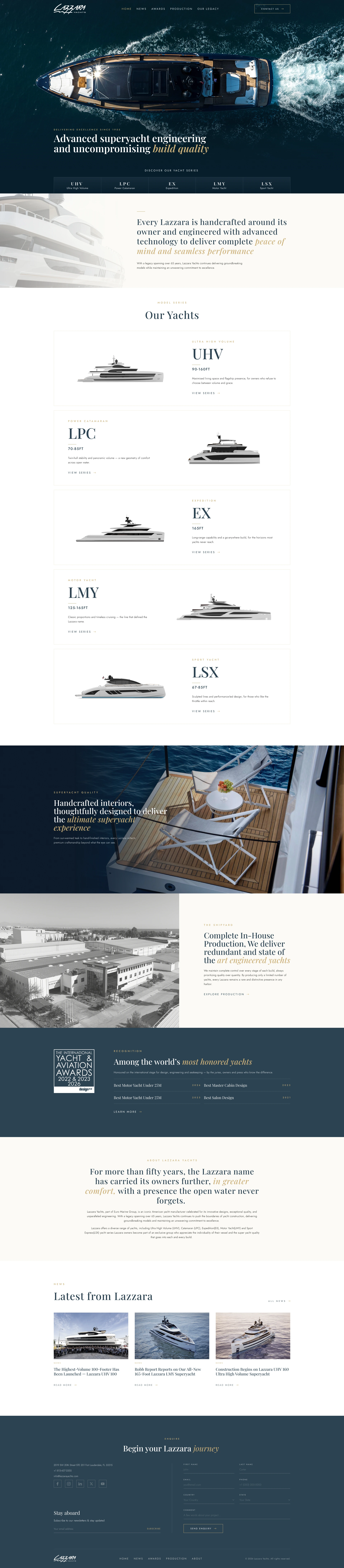
↑ Upper half: up · Lower half: down ↓ · Closer to the edge: fasterSwipe inside the frame to explore ↕
The LPC 300 page reveals the model through its character, exterior and interior photography, deck plans and technical specifications.

↑ Upper half: up · Lower half: down ↓ · Closer to the edge: fasterSwipe inside the frame to explore ↕
Production and the shipyard’s history have dedicated pages. News and awards extend the same visual language: deep blue, light spaces, serif headlines and restrained gold accents.
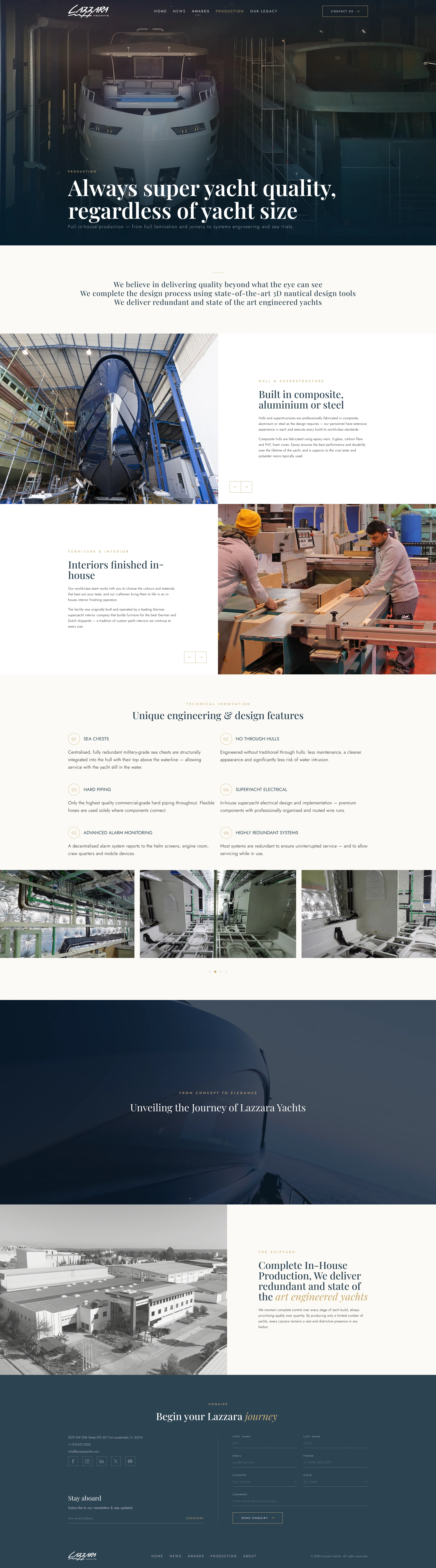
↑ Upper half: up · Lower half: down ↓ · Closer to the edge: fasterSwipe inside the frame to explore ↕
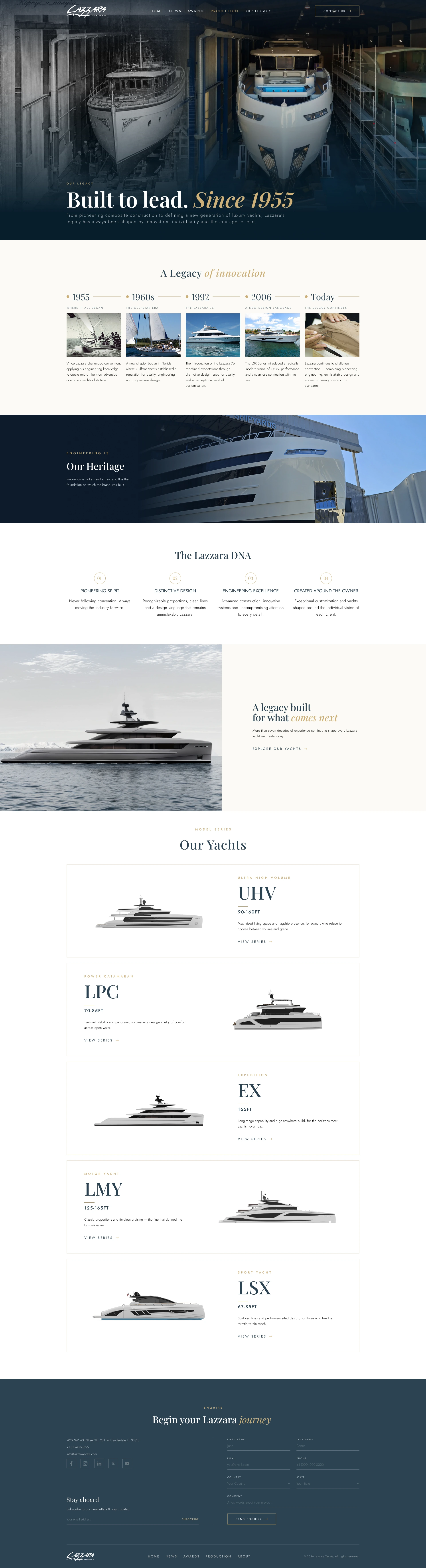
↑ Upper half: up · Lower half: down ↓ · Closer to the edge: fasterSwipe inside the frame to explore ↕
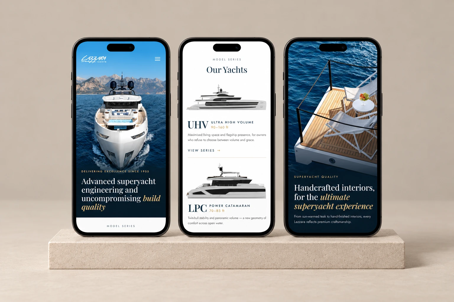
The home page keeps its sequence on mobile, while photography, series cards, navigation and the enquiry form are composed for a narrow screen. Explore the complete mobile home page by scrolling inside the frame.

↑ Upper half: up · Lower half: down ↓ · Closer to the edge: fasterSwipe inside the frame to explore ↕
Large yacht images lead the composition and keep the product at the centre of attention.
Serif headlines and gold italics create a hierarchy alongside the photography.
Yacht series lead to a model page with key specifications in the opening section.
Mobile layouts adapt navigation, copy and photography to a narrow screen.