A shared white wordmark
Rounded lettering connects the flavours and maintains contrast against coloured backgrounds.

One name. A full range of flavours.
Logo and packaging design for an energy bar range from Tashkent. A shared white wordmark, ingredient illustrations and distinct colours connect the flavours. Product scenes are illustrative mockups.
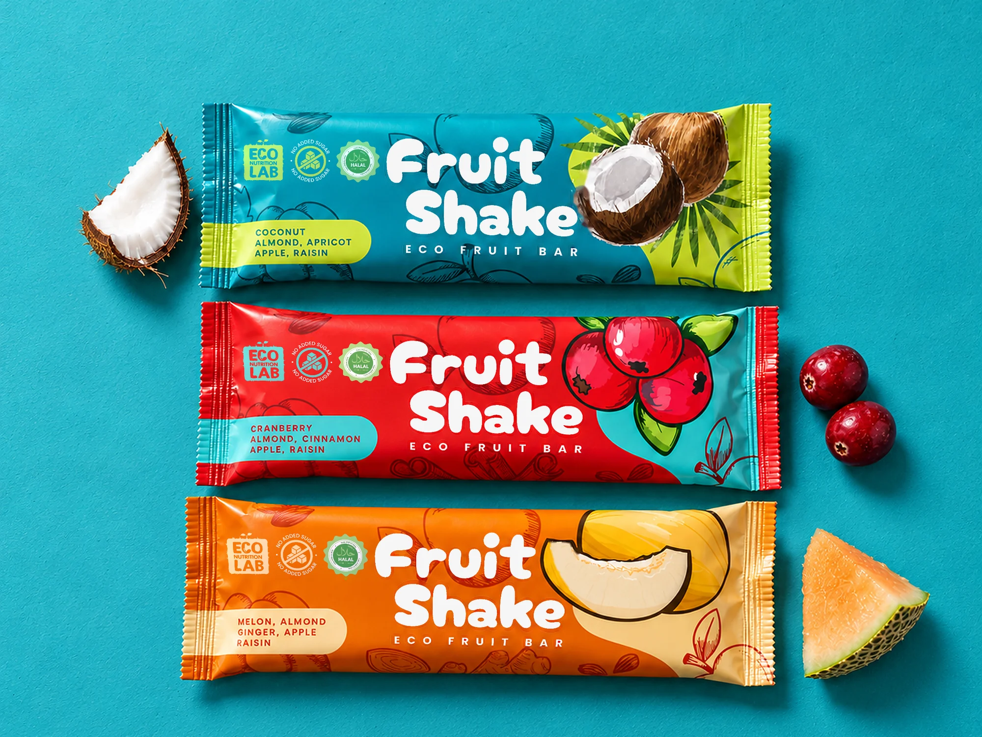
Logo and packaging design for the Fruit Shake energy bar range, Tashkent, 2025. The brief was to connect different flavours in one recognisable range.
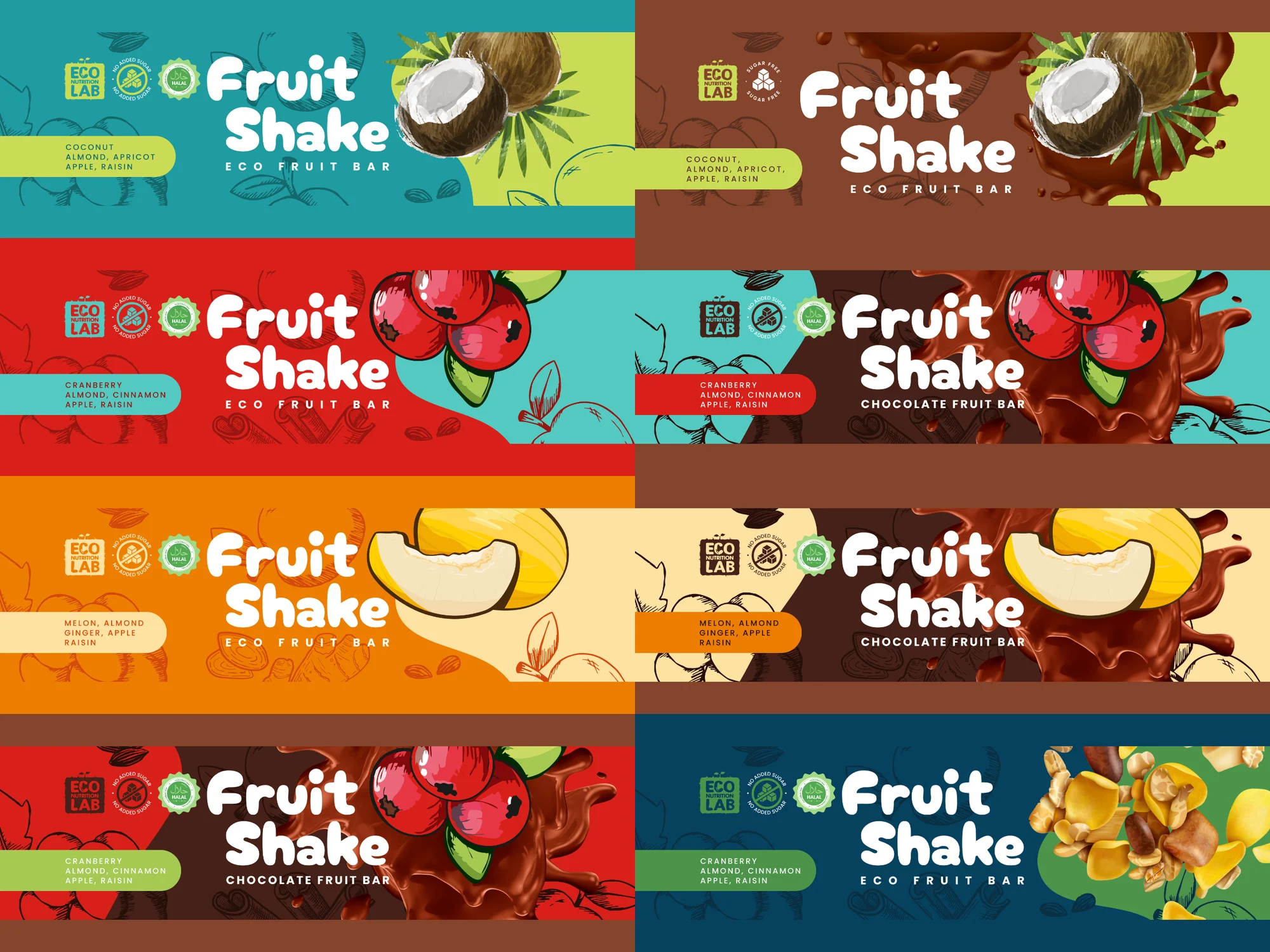
A shared white wordmark connects the packaging, while colours and ingredient illustrations distinguish the variants. The rounded lettering retains its character on turquoise, red, orange and chocolate backgrounds.
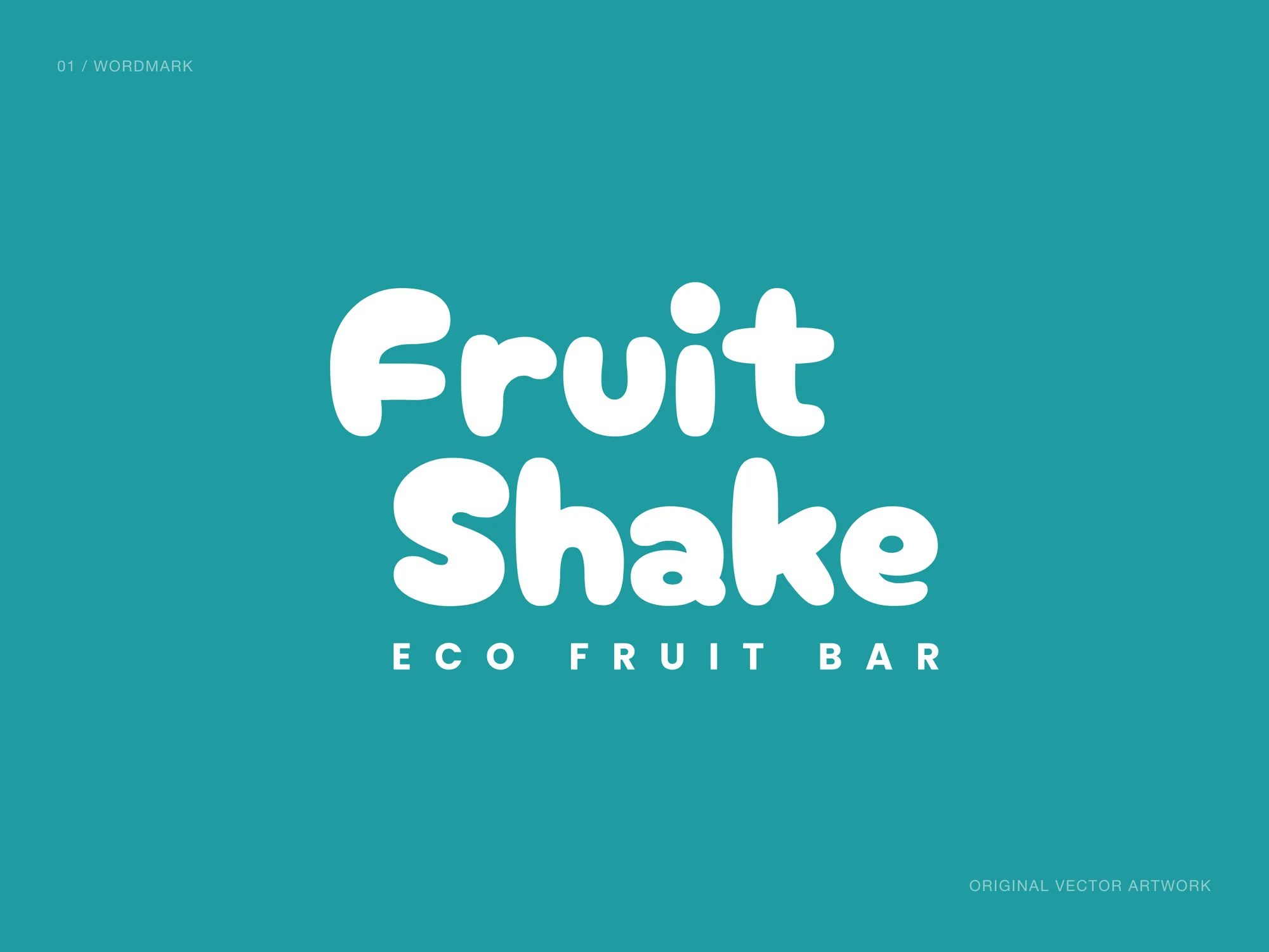
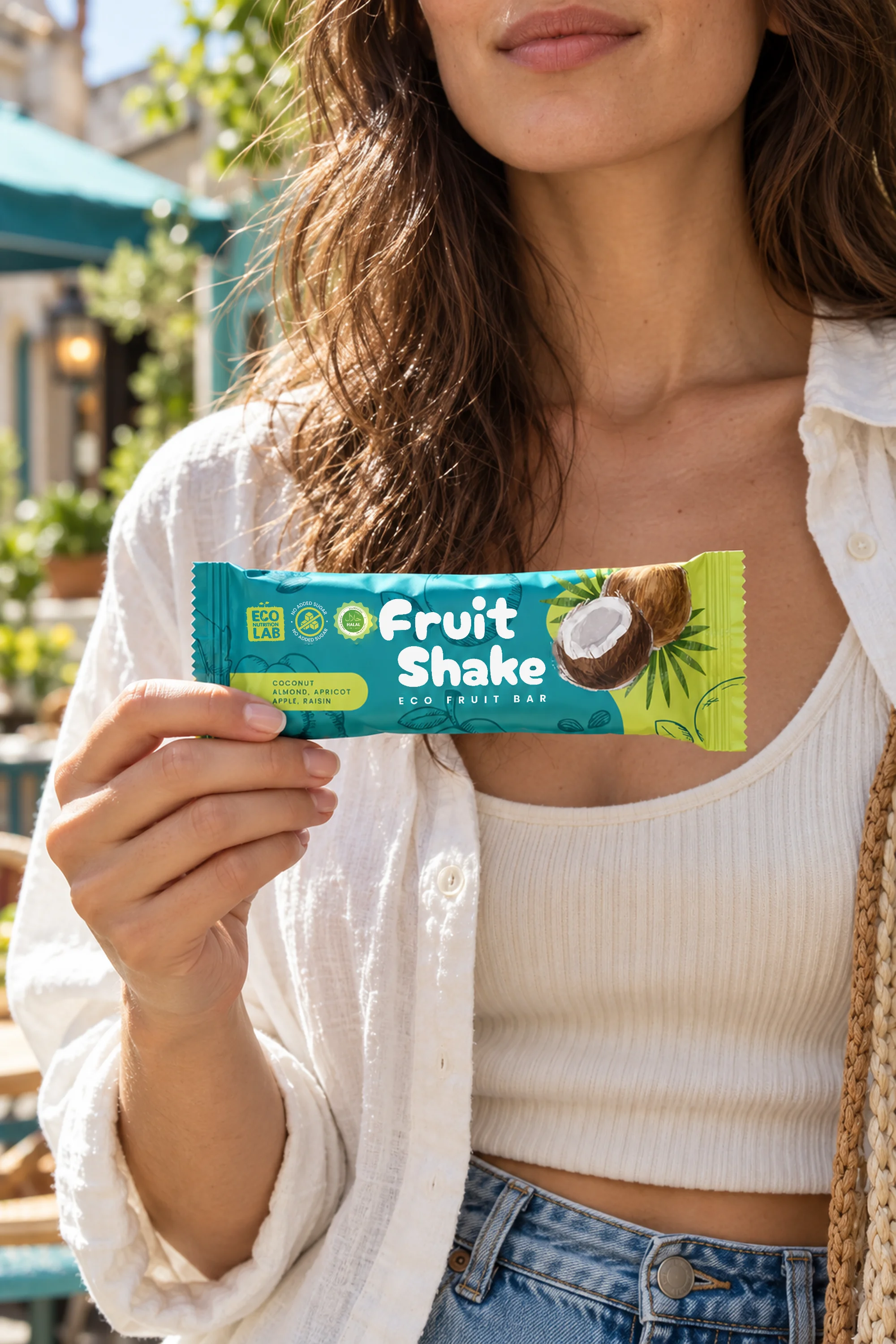
Rounded lettering connects the flavours and maintains contrast against coloured backgrounds.
Illustrations of coconut, cranberry, melon and other ingredients distinguish the variants.
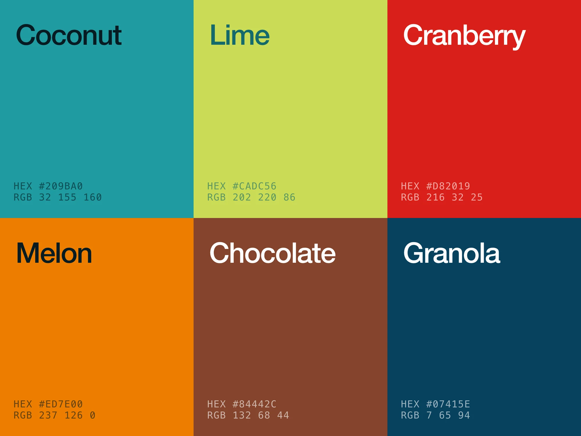
Turquoise, lime, red, orange, chocolate and dark blue form the range palette.
The name, illustration and information panel follow a shared structure across eight front panels.
Coconut, cranberry, melon, chocolate variants and granola share a common composition. Eight original front panels show how the design works across the range.
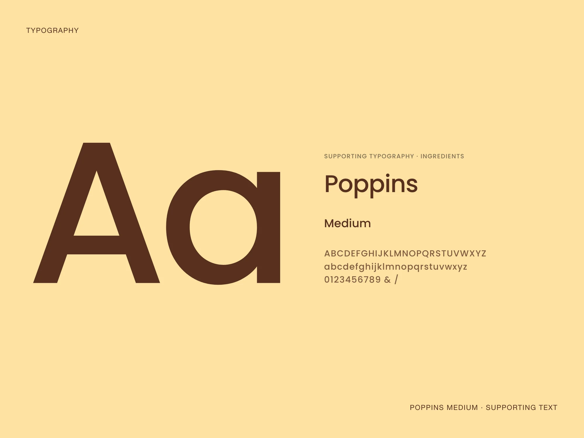
The palette comes from the source designs. Poppins Medium is used for supporting text; the original wordmark is presented as vector outlines.
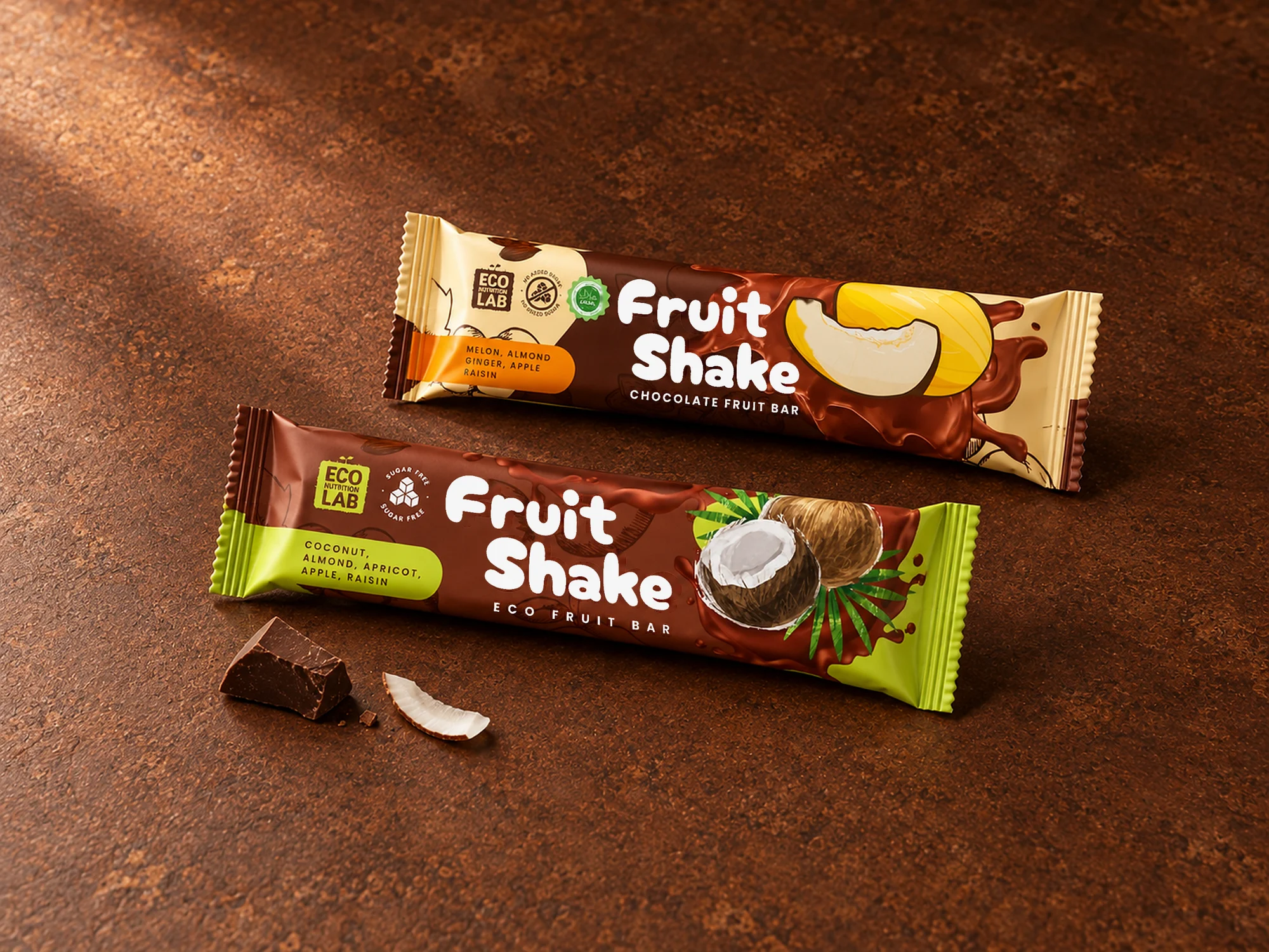
The case brings together original artwork, colour, typography and product scenes. My role was logo and packaging design.
The scenes are illustrative mockups, not photographs of production. The case makes no claims about a launch or commercial results.