A distinctive bite
The fruit symbol in the “o” connects the name to the product category.

Fruit with a bite. A brand with character.
A logo and identity concept for a dried and freeze-dried fruit and berry brand. A fruit with a bite, four flavours and warm product scenes. Packaging is a concept visualisation.
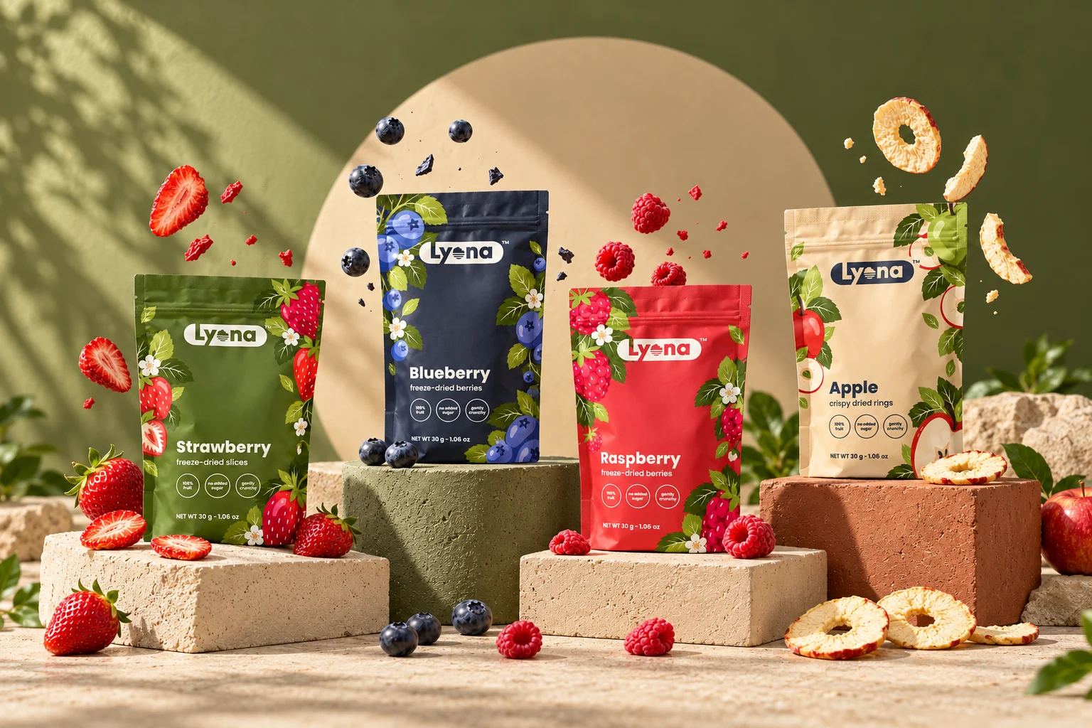
Lyona is a logo concept for a dried and freeze-dried fruit and berry brand. The aim was to express a fruit snack through a simple shape that remains recognisable without the full name.
The “o” becomes a round fruit with a bite taken out of it. Horizontal stripes suggest thin fruit slices or the sun above the horizon.
A rounded badge holds the name together, while the fruit symbol works on its own as an icon or packaging accent.
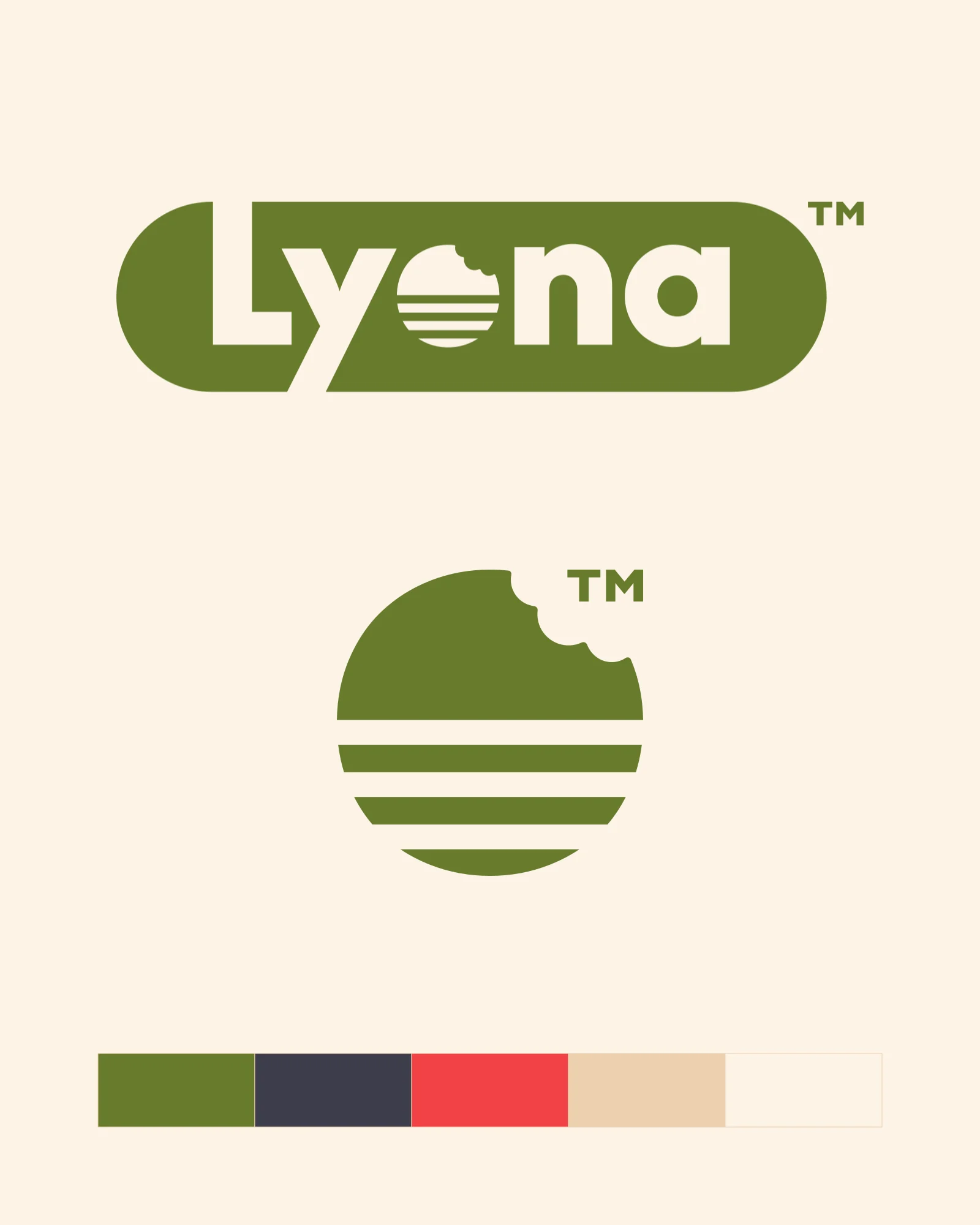
The fruit symbol in the “o” connects the name to the product category.
The striped, bitten fruit retains its character as a standalone icon.
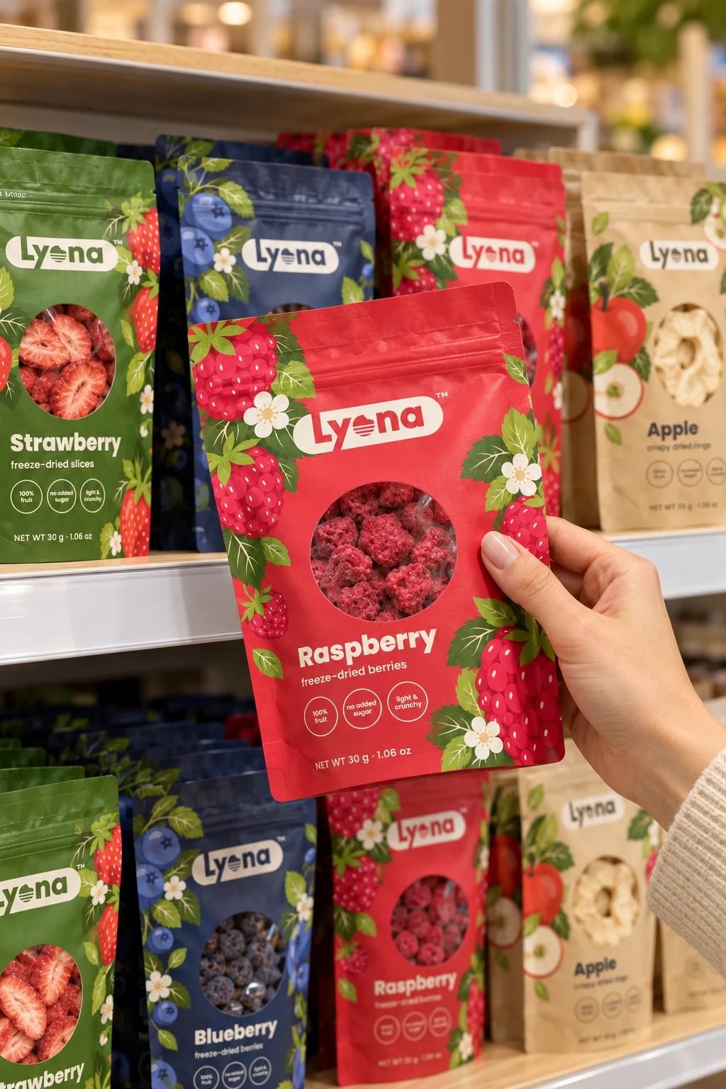
Green, ink, berry red and sand distinguish four variants within one shared layout.
Warm light, stone podiums and product textures connect the studio and everyday scenes.
Strawberry, blueberry, raspberry and apple each have their own colours and illustrations. A shared logo, layout and bite-shaped window connect them as a range.
Olive, ink, berry red, sand and cream form the concept palette. Poppins provides the typography.
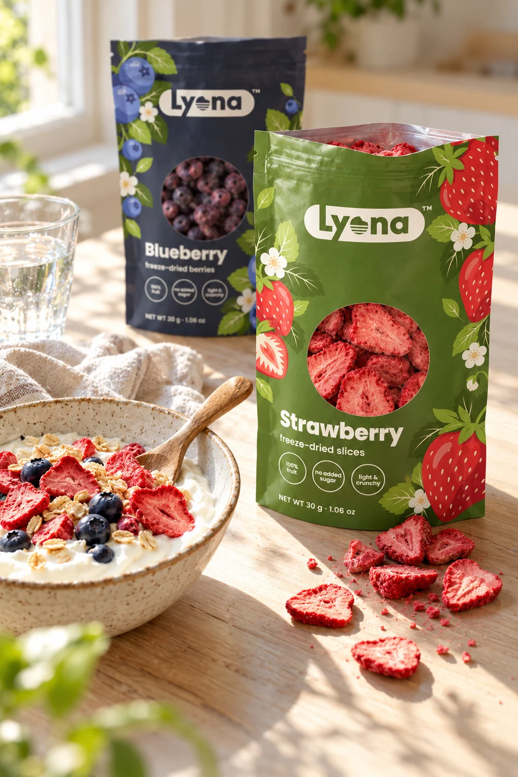
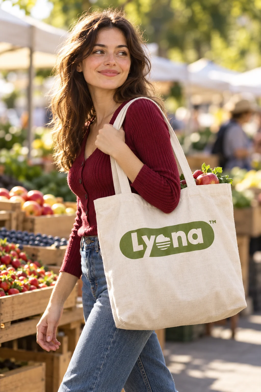
Podiums present the range together; a shop shelf, breakfast and a tote show it in different situations. Warm light and natural textures support the fruit-led character.
The work includes a logo concept and an identity demonstration. Packaging and generated scenes are concept visualisations.