A direction for interaction
A coral arrow enters the t, expressing the reverse request service model.

The offer comes to the buyer.
Logo and visual identity for a Ukrainian reverse request marketplace: buyers post what they need and sellers send offers.
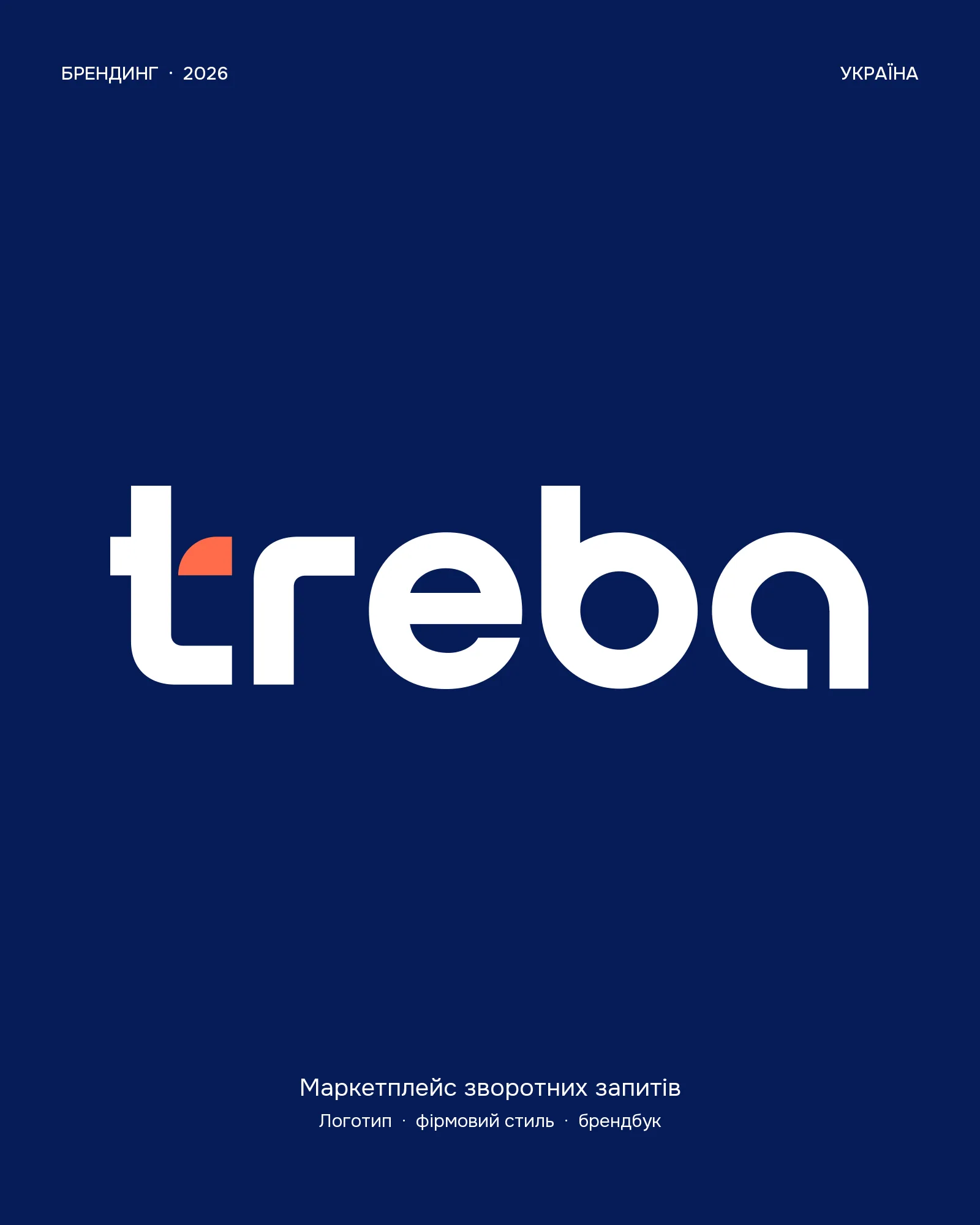
treba is a Ukrainian reverse request marketplace. Instead of browsing listings, buyers post what they need and receive offers from sellers. The logo and visual identity needed to express that interaction.
A coral arrow enters the lowercase t from outside. The mark shows the direction of the service: the offer moves towards the buyer.
The arrow remains the focal point in both the full logo and the standalone symbol for compact placements.
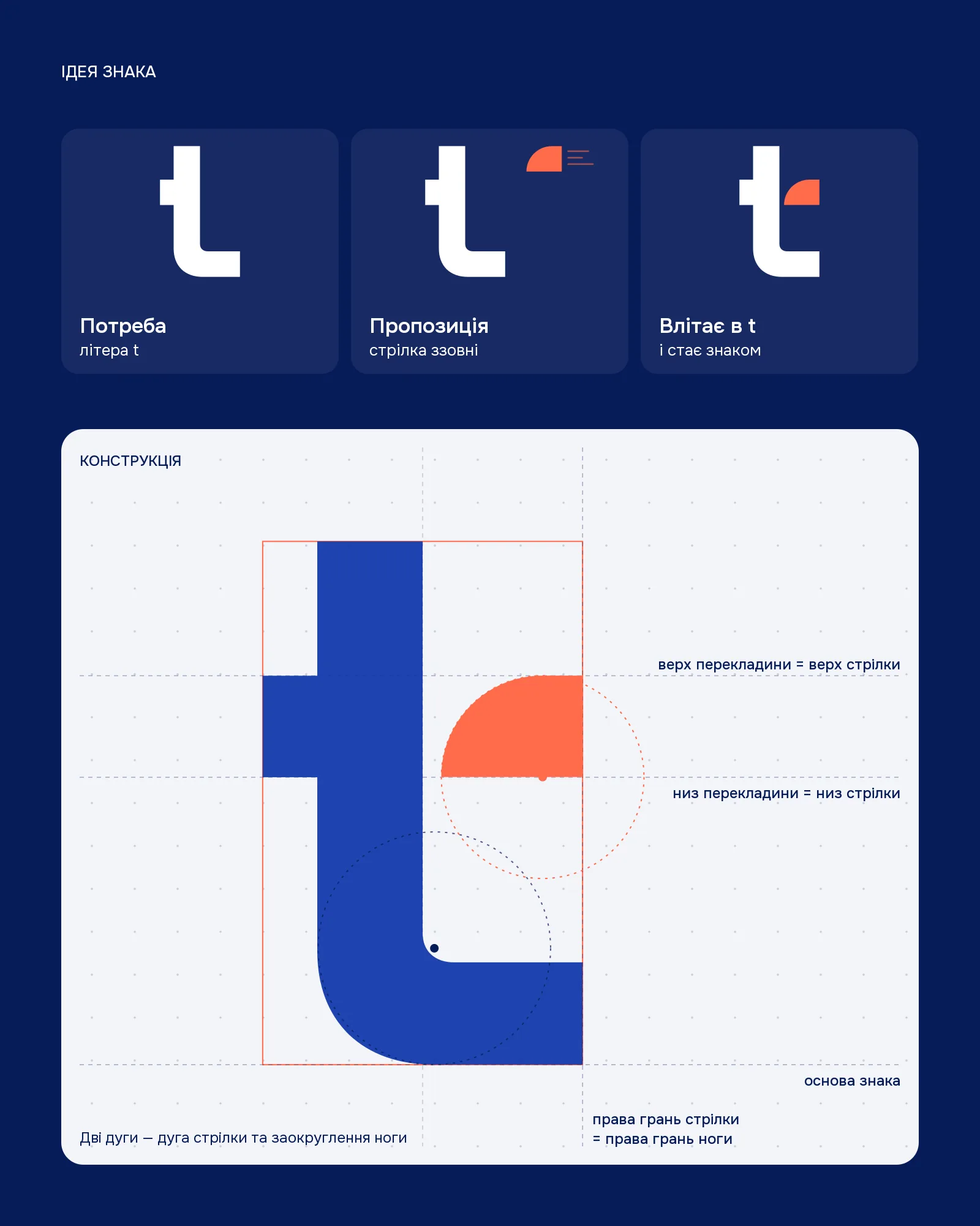
A coral arrow enters the t, expressing the reverse request service model.
The arrow remains the focal point in both the full logo and standalone symbol.
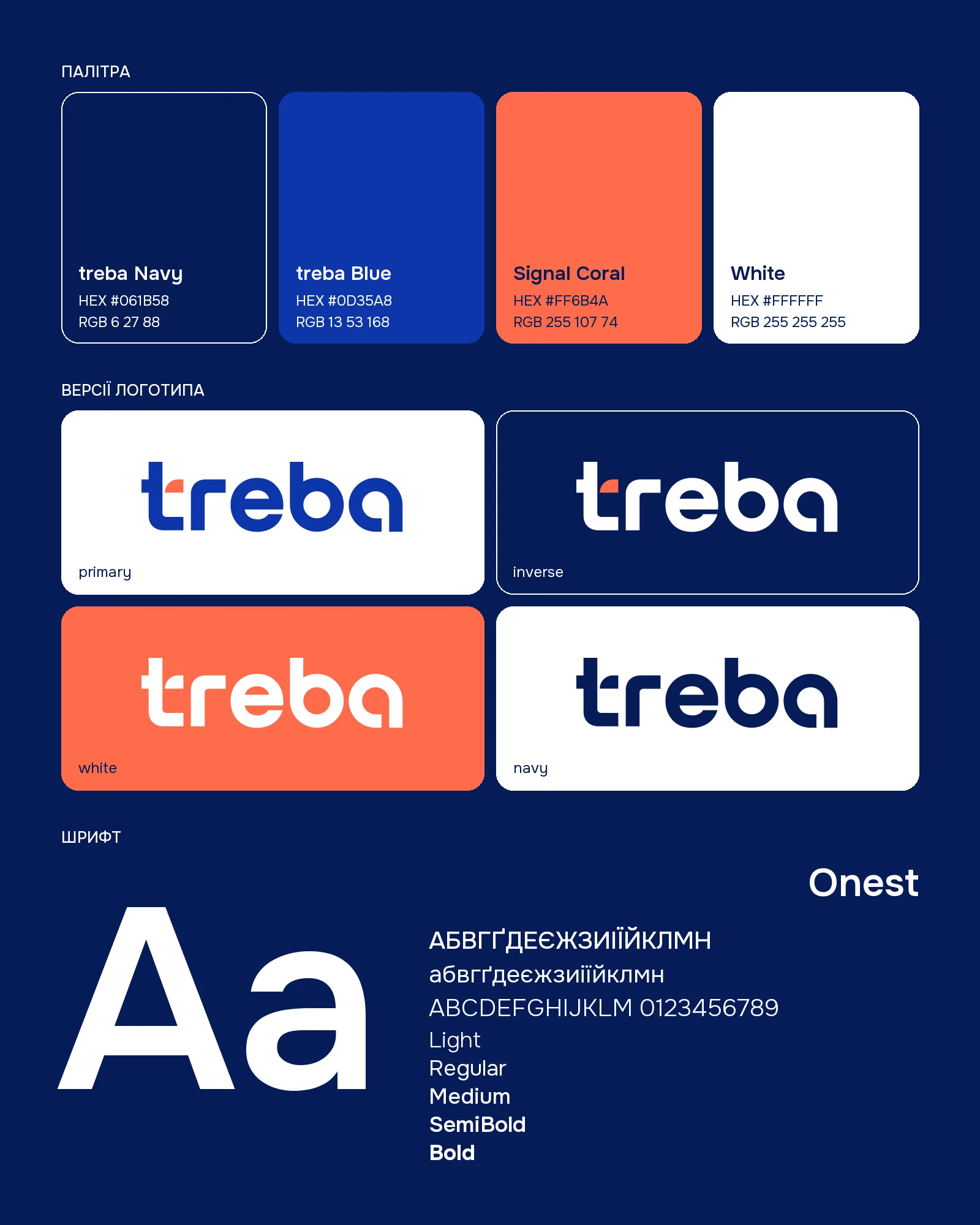
Navy and Blue form the foundation, while Signal Coral highlights the key element.
Primary, inverse and single-colour versions allow the identity to work on different backgrounds.
treba Navy and treba Blue form the foundation, while Signal Coral highlights the arrow. Onest provides a readable typographic voice.
Primary, inverse and single-colour logo versions allow the identity to work across different backgrounds.
From the idea behind the mark to everyday use: symbol anatomy, clear space, palette, colour proportions and typographic hierarchy.
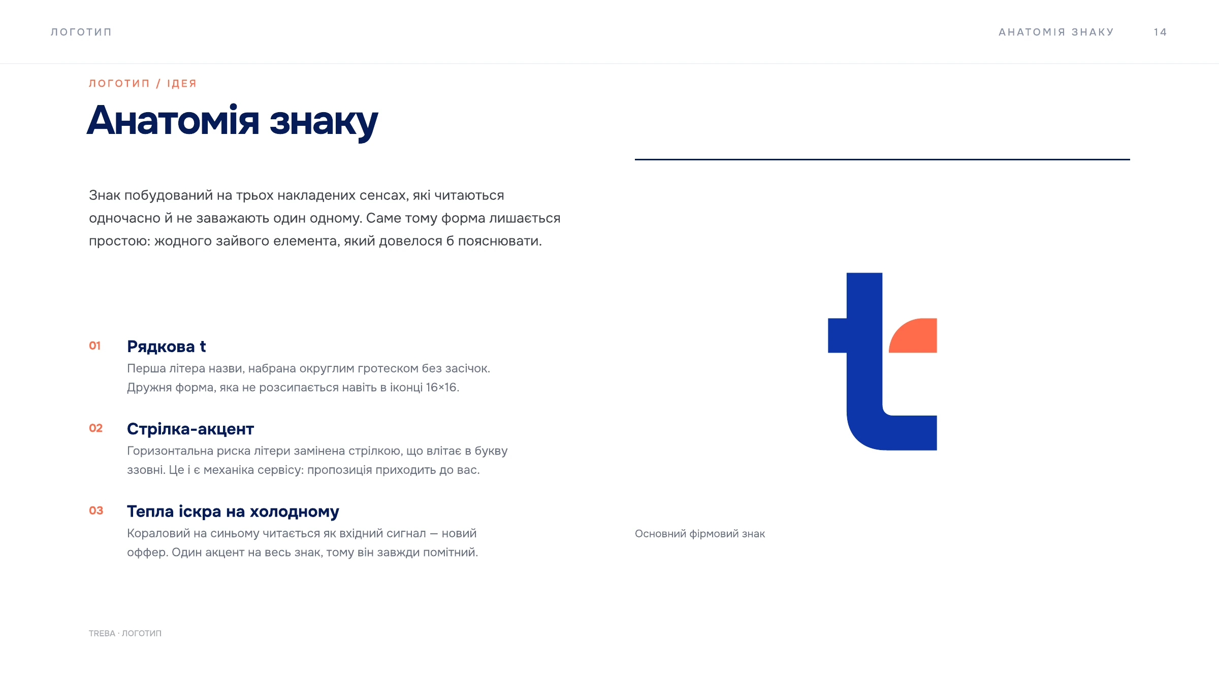
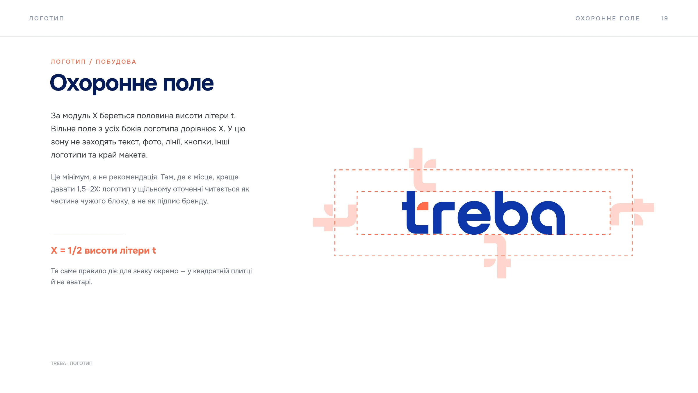
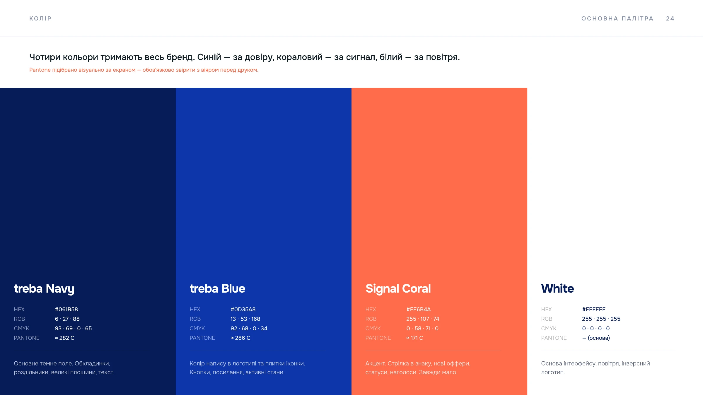
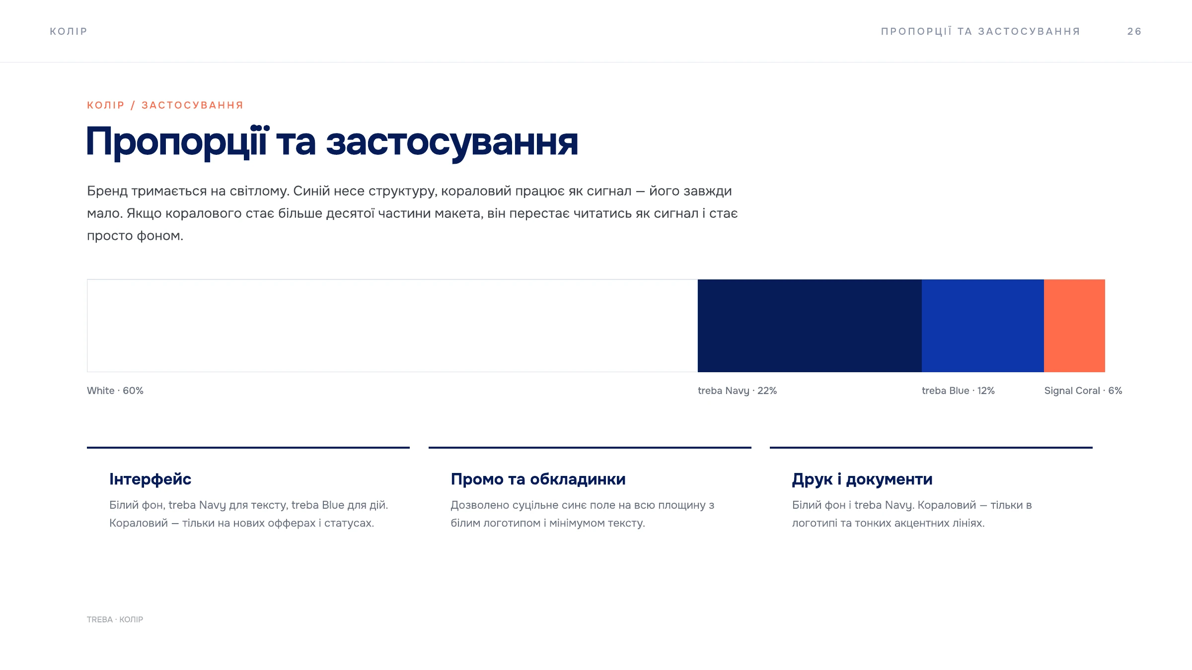
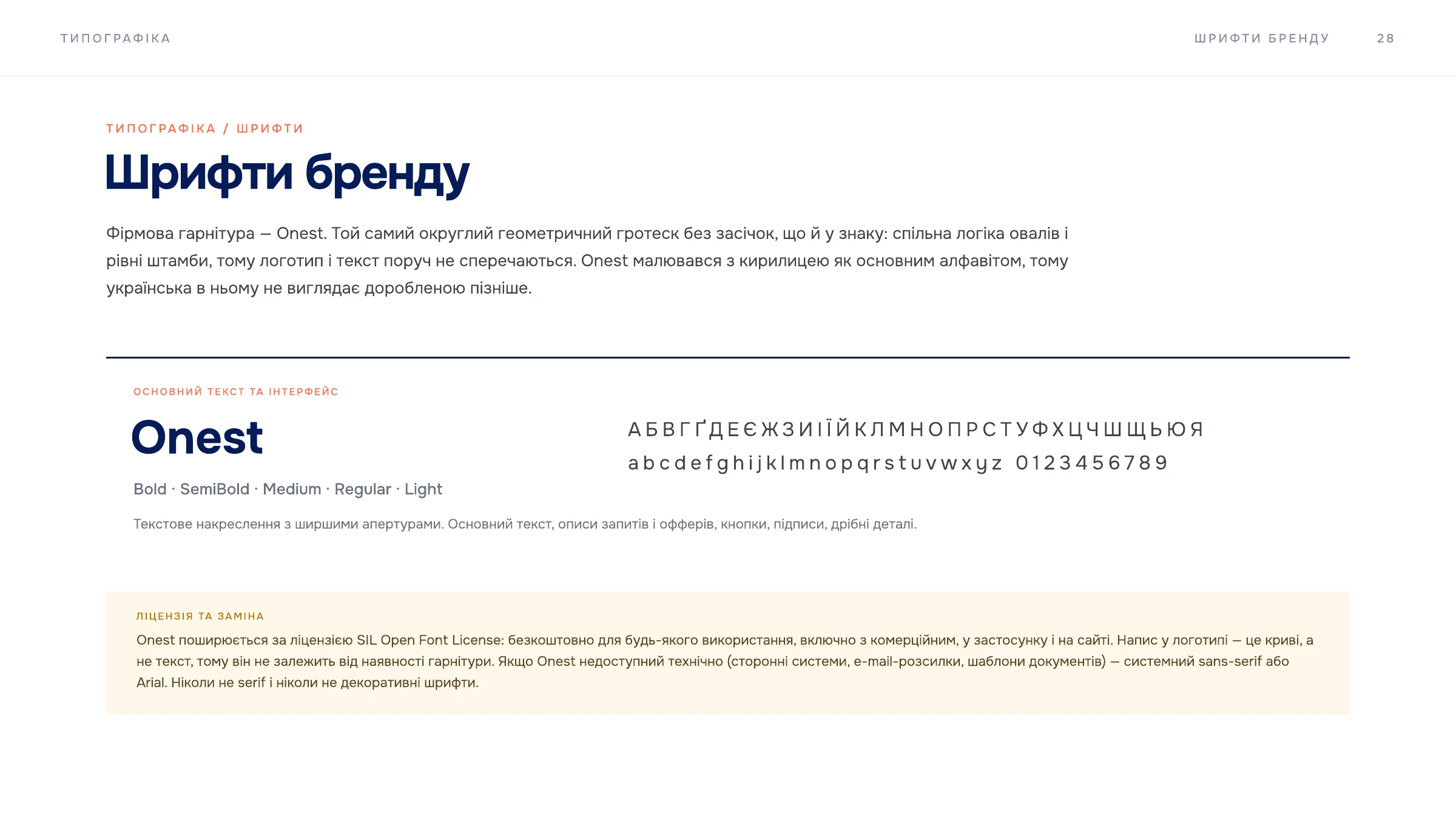
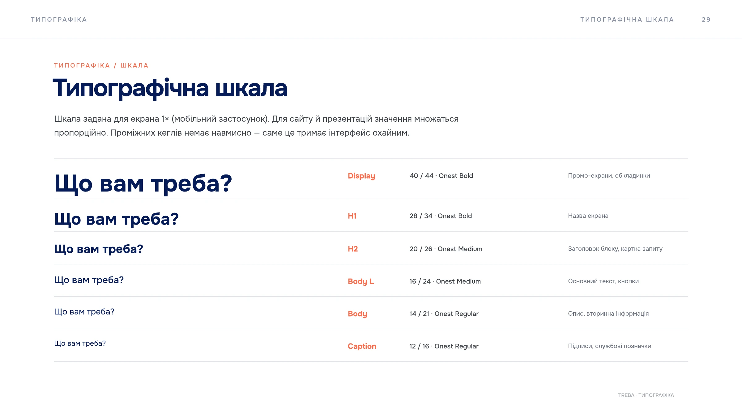
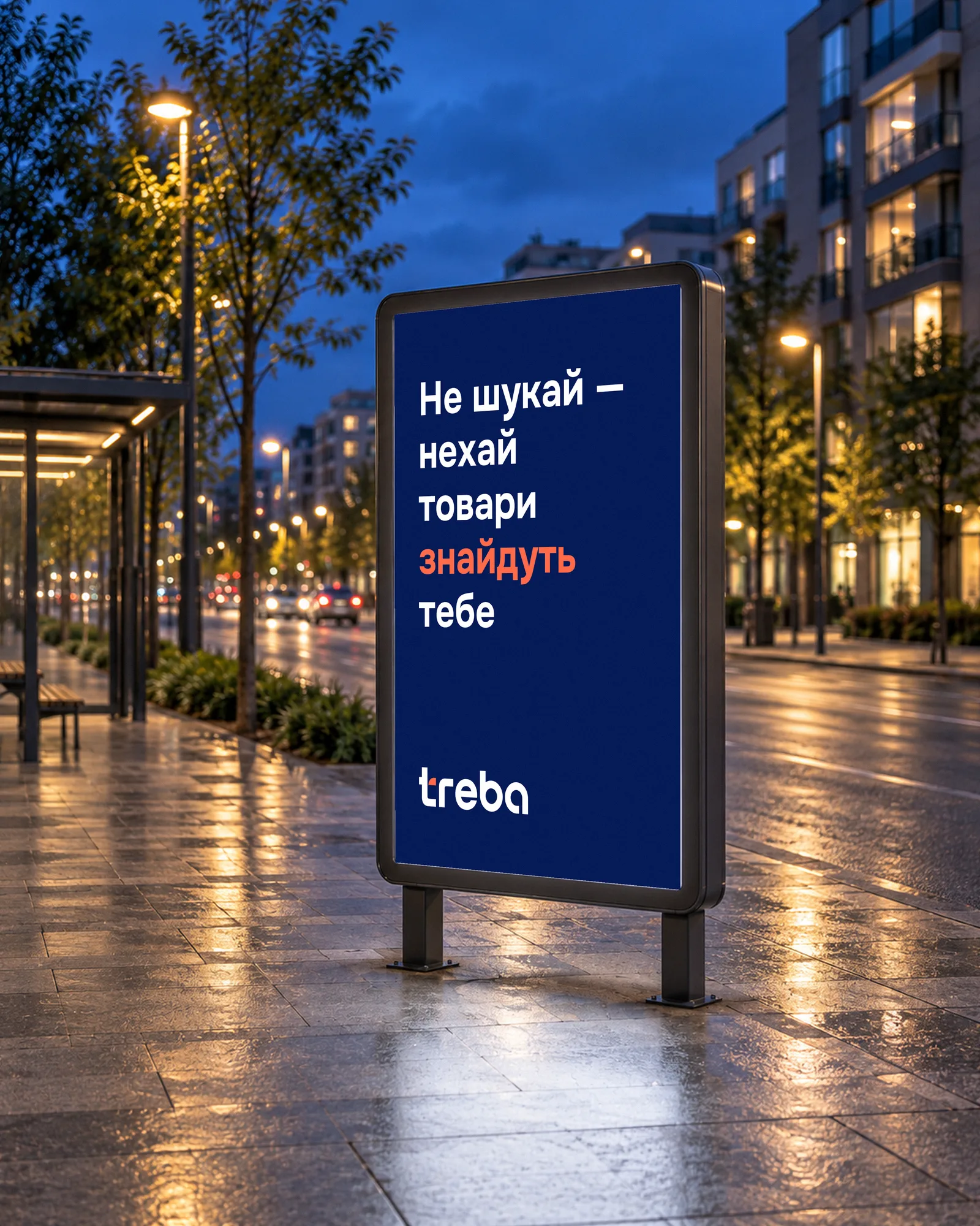
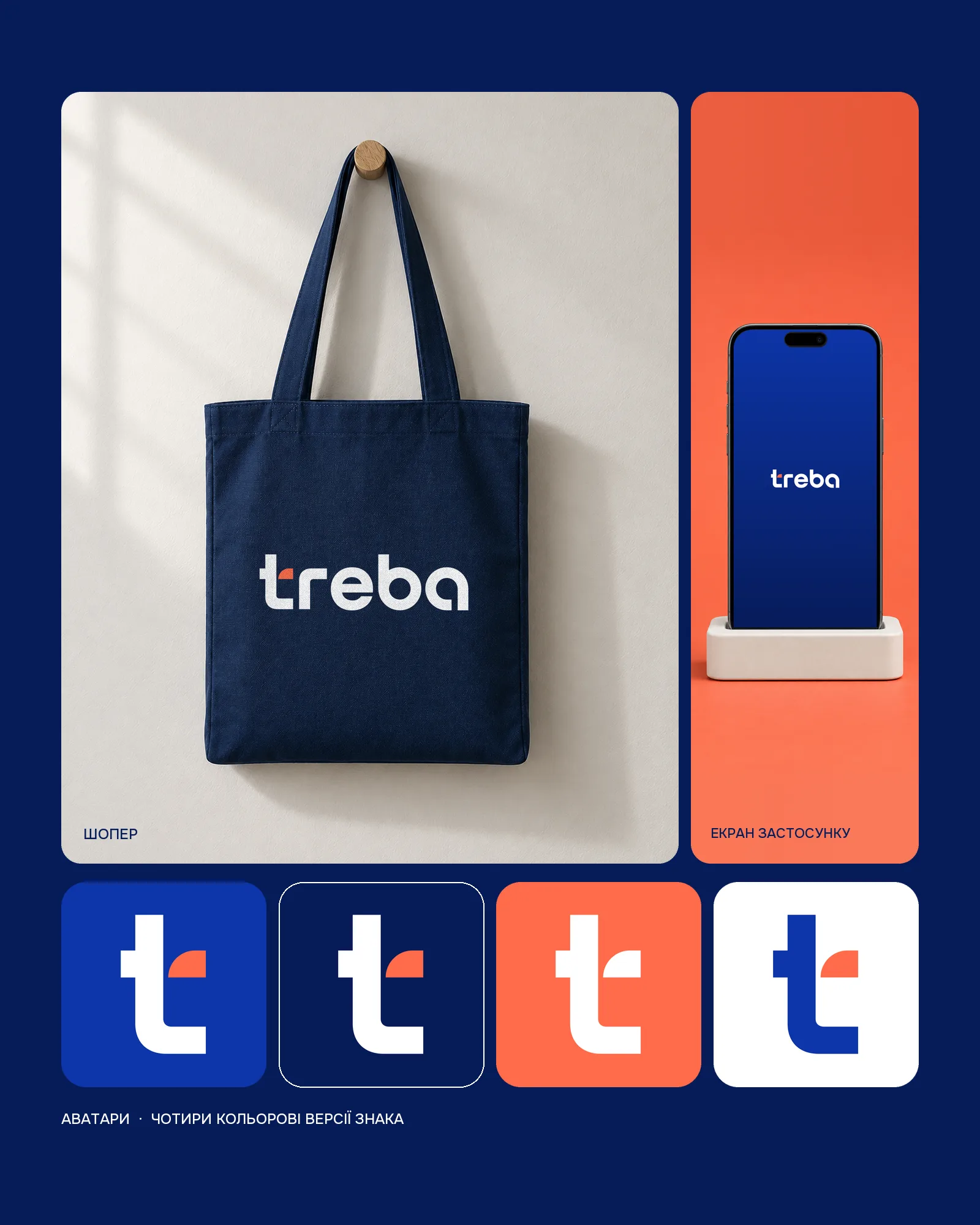
The project includes the logo, visual identity and brand book. The case shows mark construction, colour, typography and illustrative applications: avatars, an app screen, a backlit street poster and a tote bag.