A chevron in the name
The arrow between TRUE and MOVE expresses forward movement, delivery and transportation.

Forward movement in every detail.
Brand book and identity for a freight transportation company. A chevron in the wordmark, a red and navy palette, and application rules from print to vehicles and signage. Scenes are illustrative visualisations.
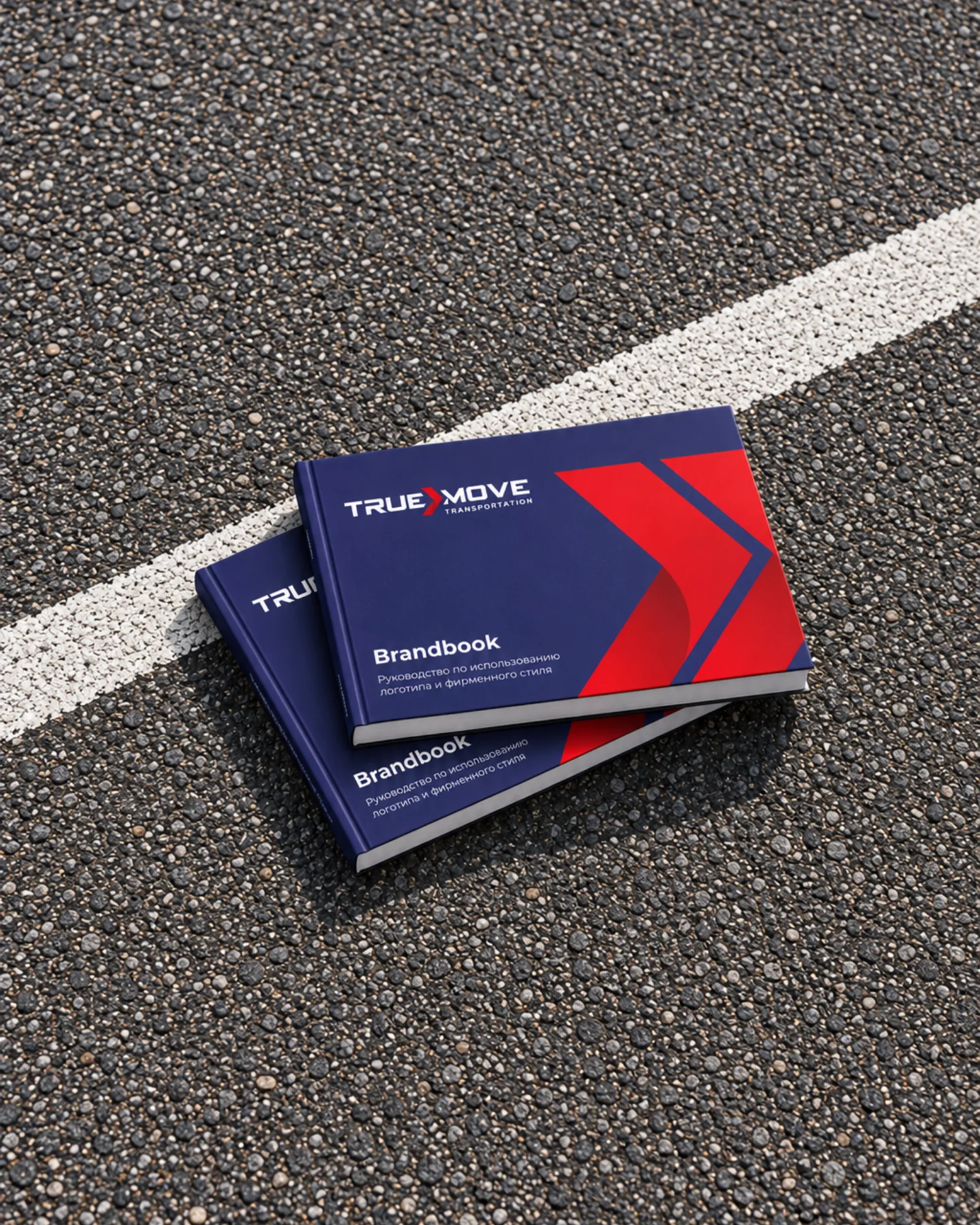
Brand book and identity for TrueMove, a freight transportation company, 2024. The brief was to create a recognisable system that works from business cards to vehicles and signage.
A forward-pointing chevron sits between TRUE and MOVE. According to the brand book, it represents forward movement, delivery and transportation. The chevron extends into patterns and application graphics.

The arrow between TRUE and MOVE expresses forward movement, delivery and transportation.
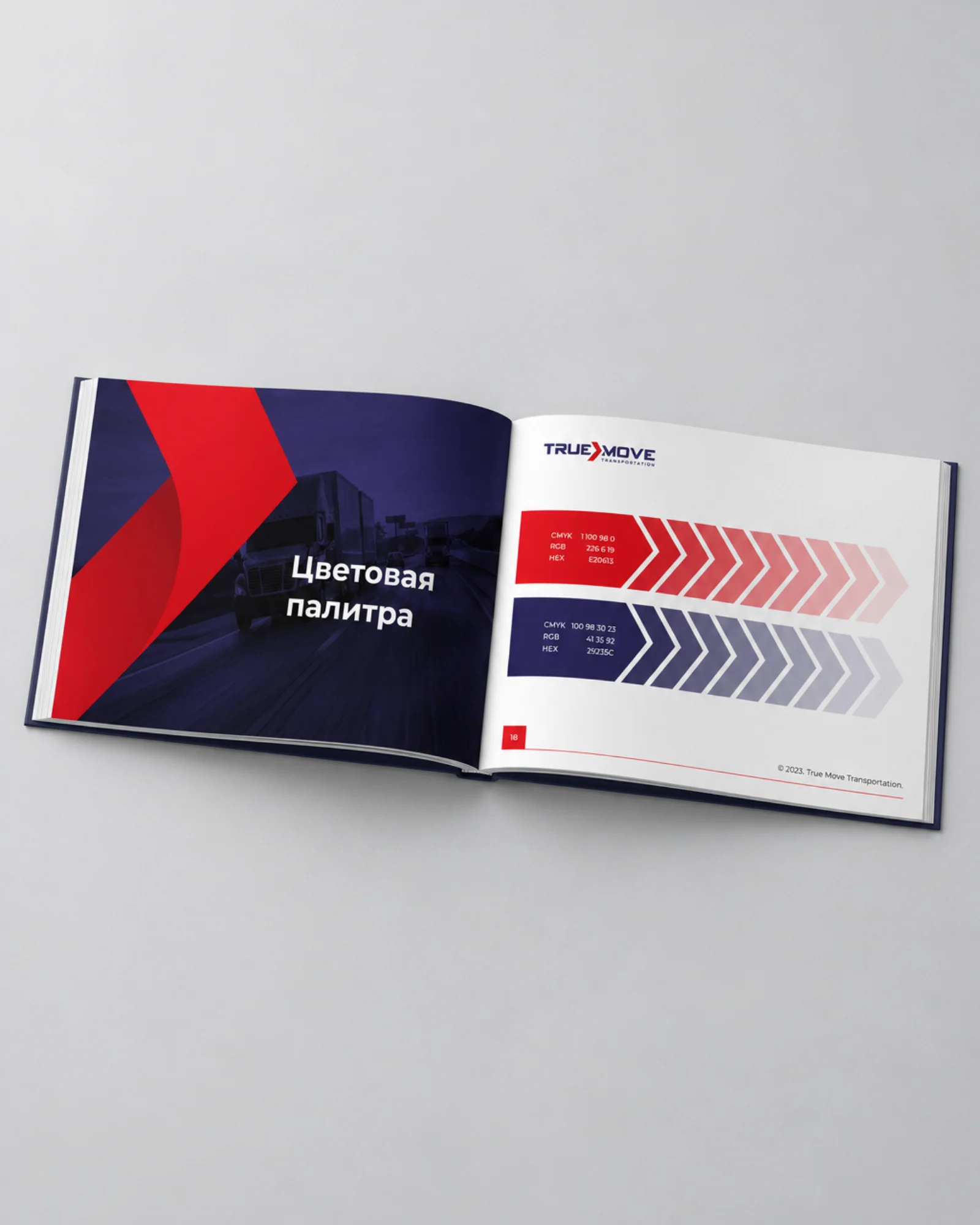
Red, navy and deep red provide a shared foundation for every application.
Repeating chevrons carry the direction of movement onto surfaces large and small.
The brand book documents logo versions, clear space, scaling, Montserrat and Arial, and application rules.
Red, navy and deep red combine with Montserrat and Arial. The brand book defines logo versions, clear space, scaling, colour and typography.
The rules cover print, vehicles, merchandise and signage. Shared colours and chevrons connect every application with the logo.
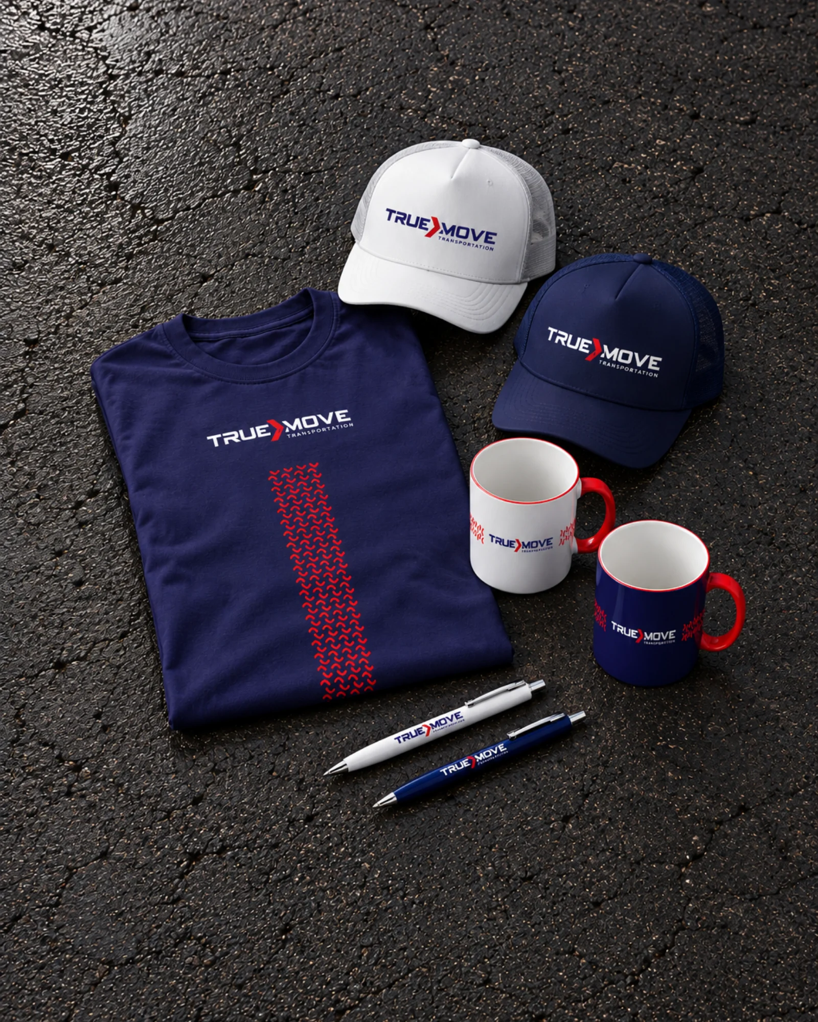


The case shows the brand book cover and spreads, vehicles, merchandise, signage and the visual atmosphere of the brand.
The scenes are illustrative visualisations, not documentation of real locations or physical production. The case makes no claims about a launch or business results.